FAQ
- What kind of icons can you use on your developer portal and where can you apply them?
- How do colors and typography affect and improve the usability and transparency of a developer portal?
- What kind of images and illustrations can support and visually improve dry technical content?
- What if you don’t have a brand font, an image bank or an own icon pack? Where can you find these and which viewpoints should you consider when selecting the elements that are right for you?
- How can you make code sections prominent and handy?
Experience and advice
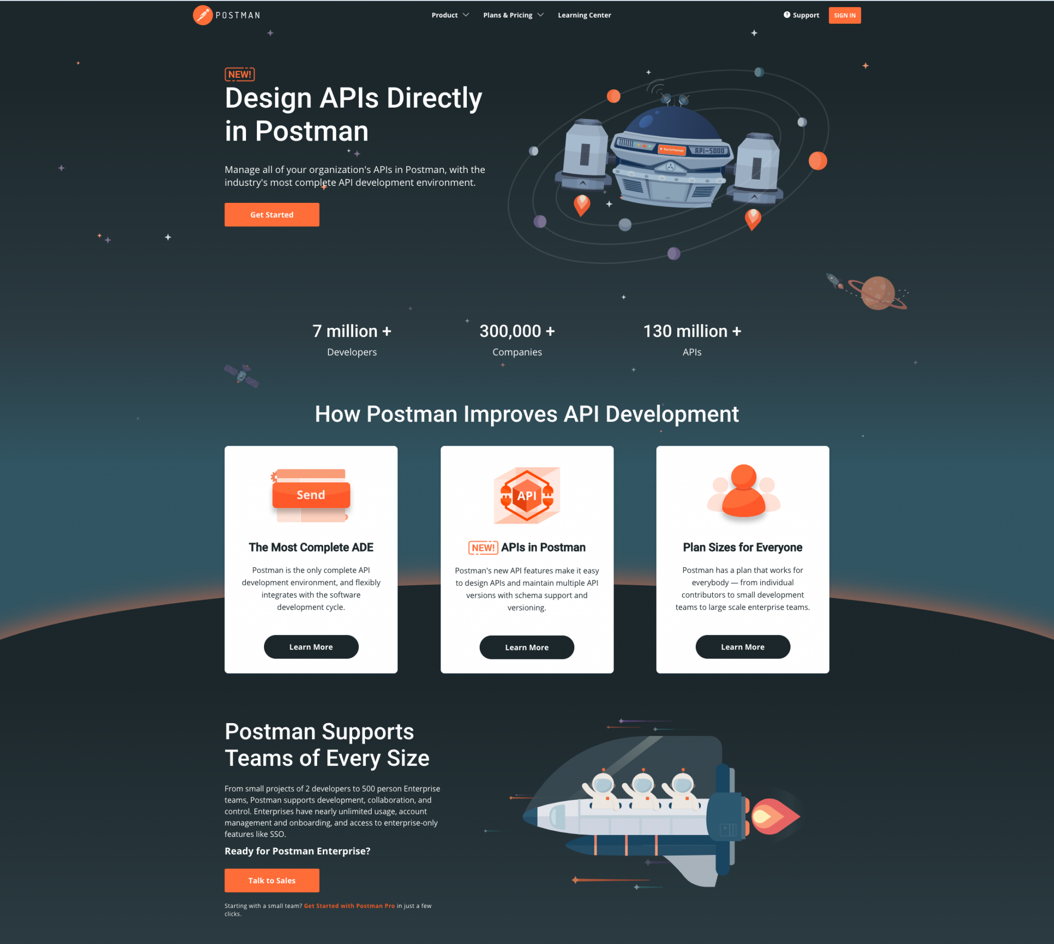
Icons
Icons play an important role in the UI of websites and of developer portals.
Functional, UI icons
Functional icons, commonly known as system icons or UI icons, visualize different functions and information in a simple way, such as search, profile, login, logout, open and close sections, pager and dropdown arrows, edit, view, delete, warnings, etc.
Some advice regarding UI icons:
- These system icons are usually smaller (24+ px) and functional thus we advice to choose an icon pack that contains simple but noticeable icons.
- Colorize them consistently on every page. E.g. If they are clickable choose a different color for their normal, selected, or hover state, and a utility color if they express a warning or error, etc.
- Try to find common, easy to understand icons that are meaningful for everyone.
- If you think that the meaning of an icon is not obvious, combine it with a textual description. For example, use tooltips if the user hovers over them. Note that on touch devices you don’t have a hover-over effect and you’ll need to figure out a different solution. Of course it is also likely that users will figure out the meaning of these icons after repeated use.
- Don’t forget that the hover effect of the functional icons (e.g. color change) gives visual feedback about their interactivity.
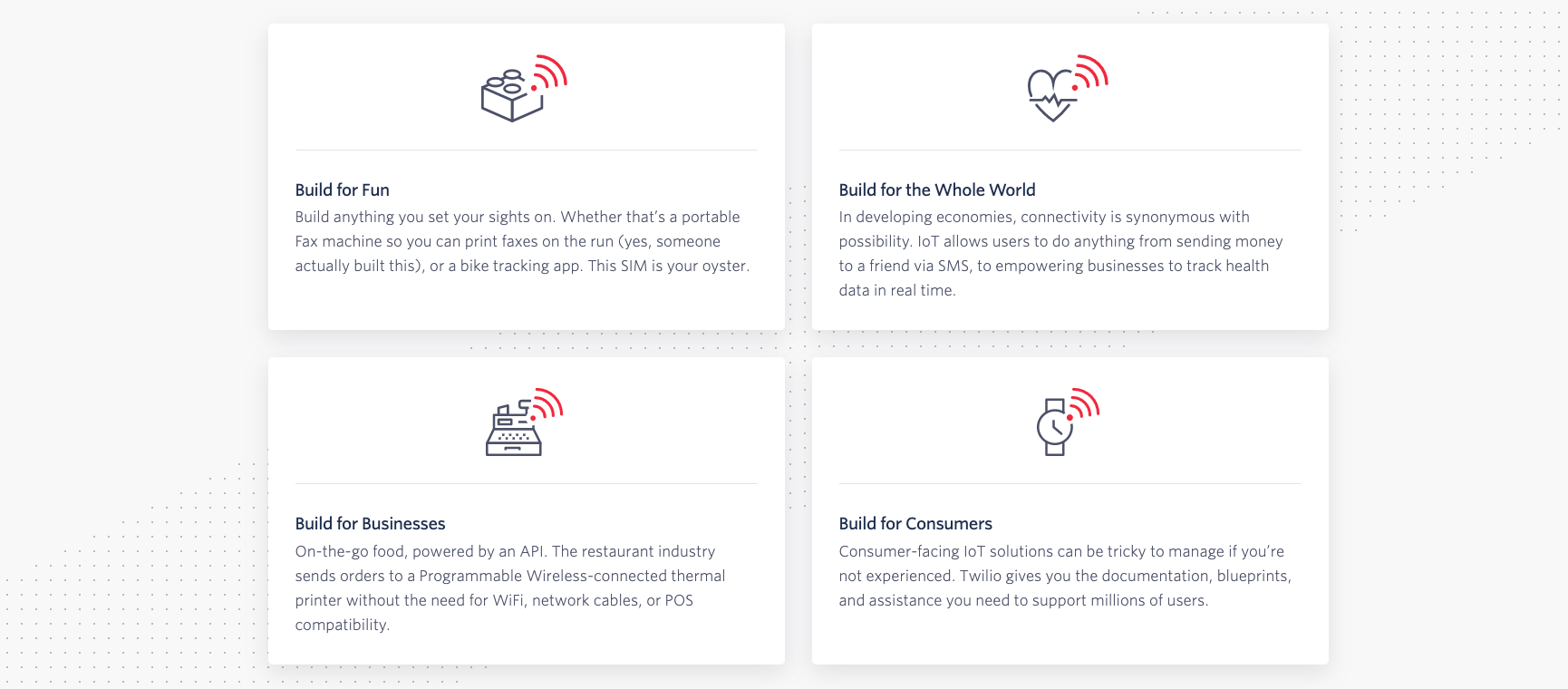
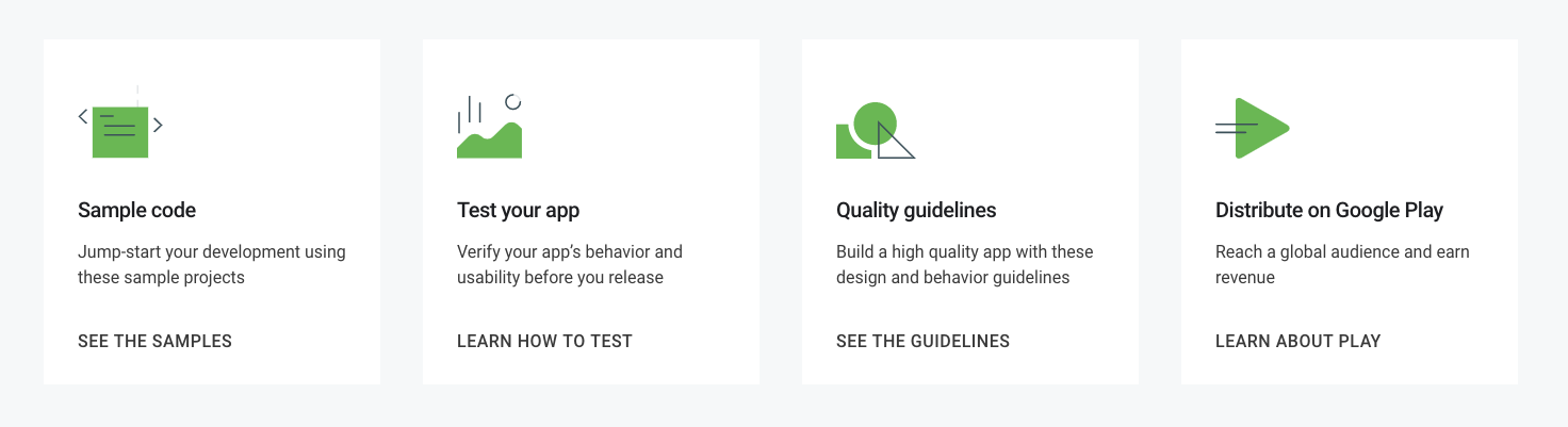
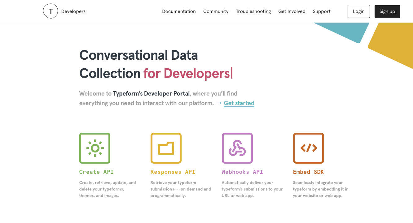
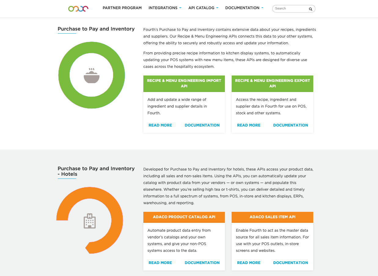
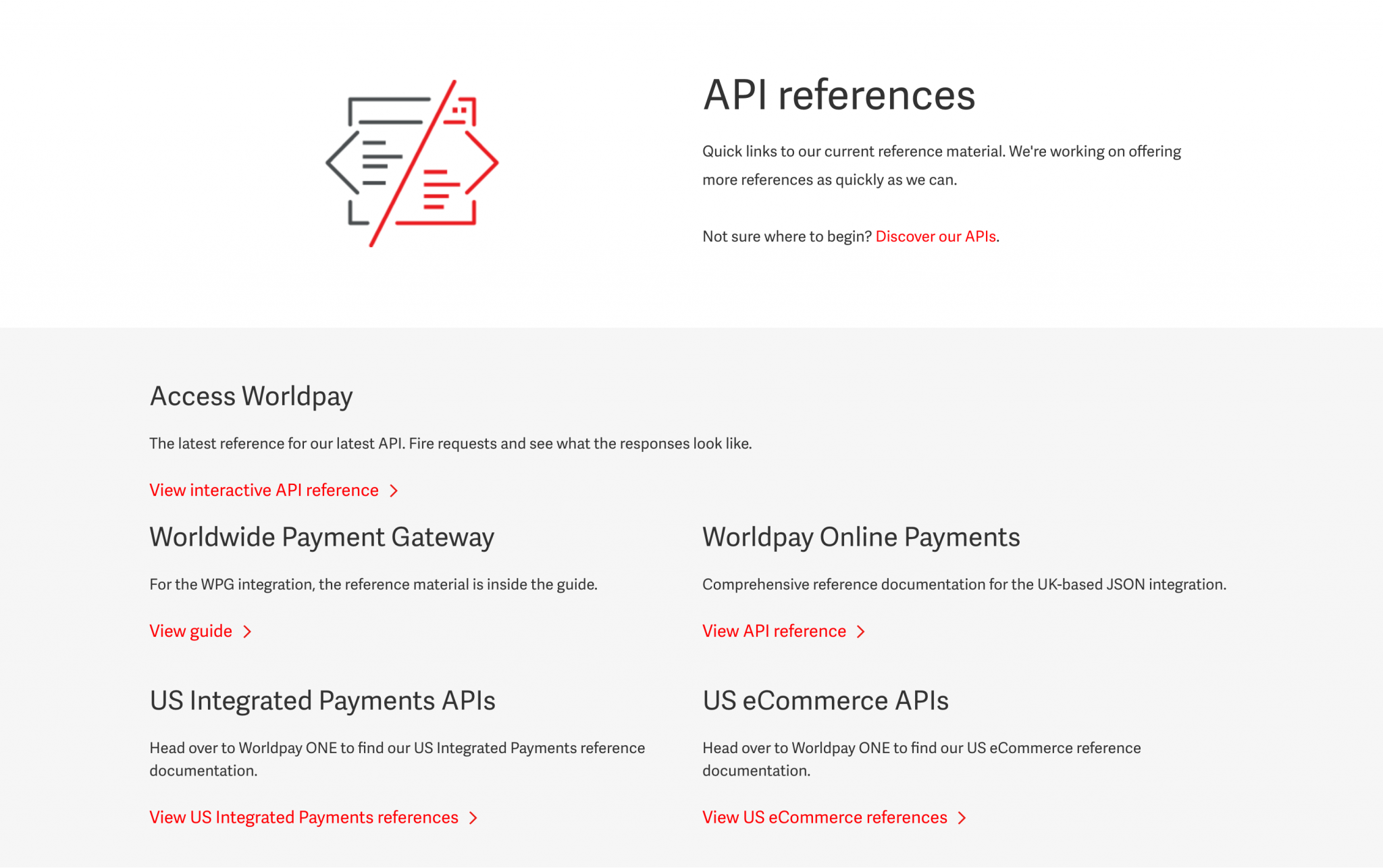
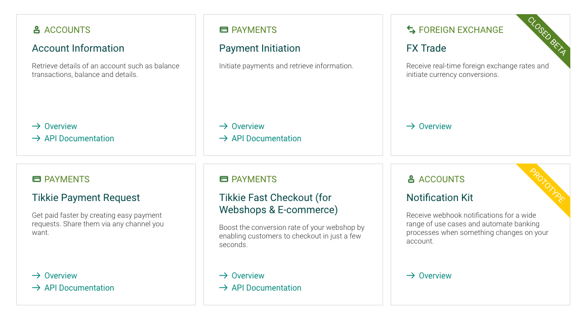
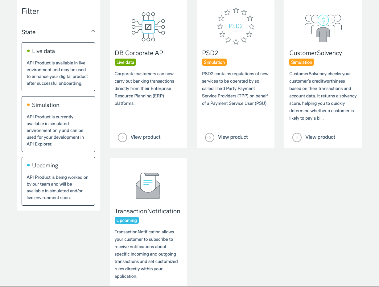
Content icons
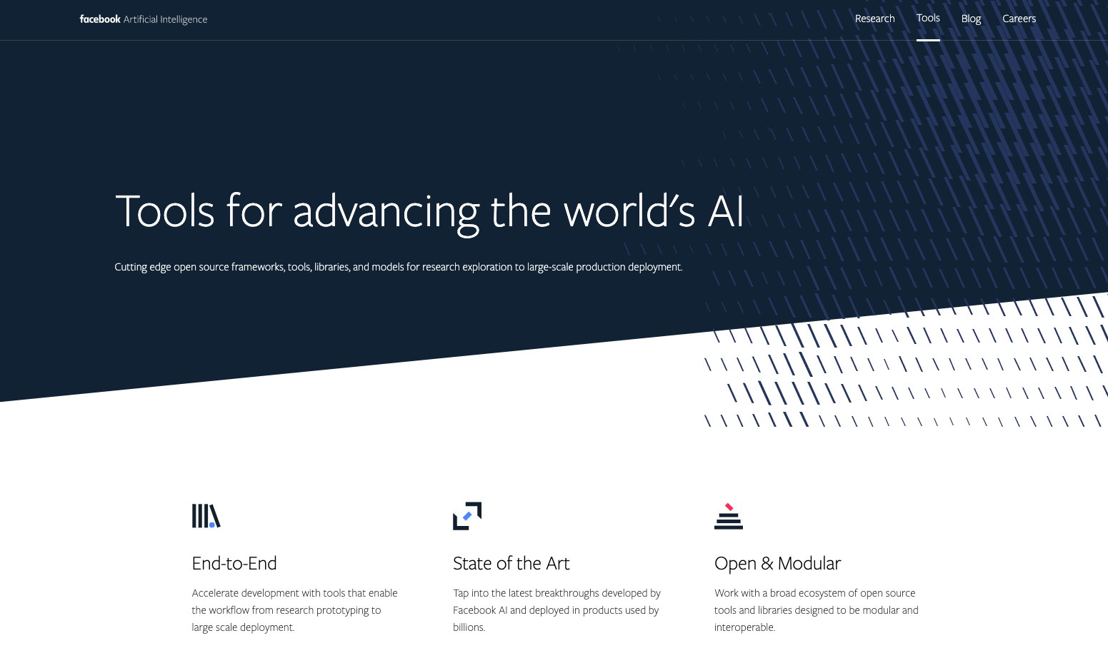
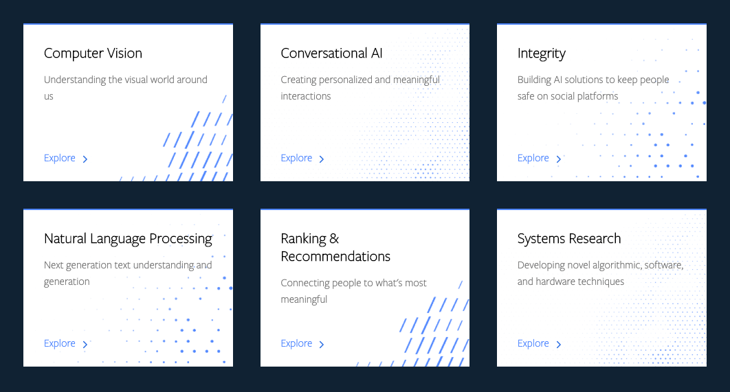
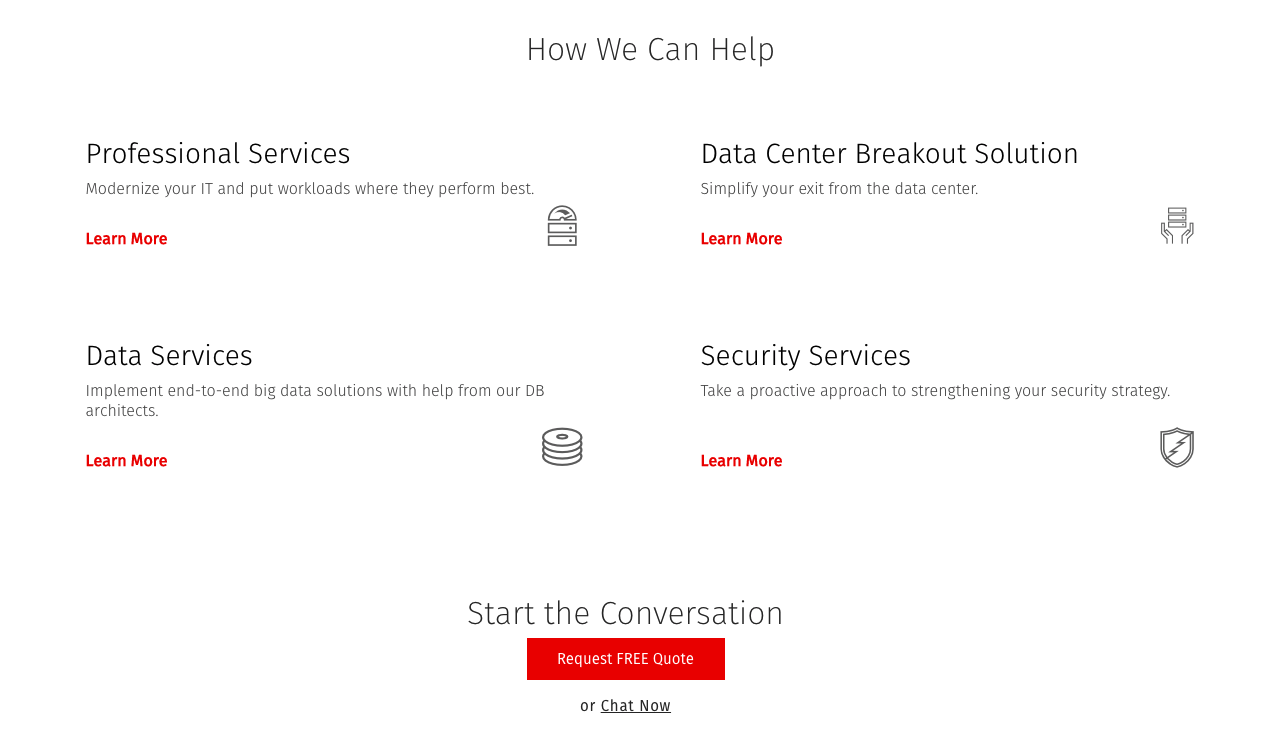
Icons are not only for navigation, interactions and buttons: you can also use them as visual elements in content sections to break the monotony and highlight the main content.
Content icons can appear in benefit sections, on cards and overview pages.
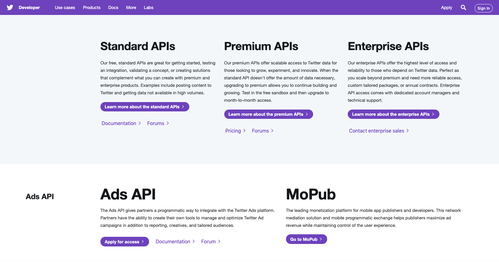
We can also use a unique icon (or image) to represent an API but don’t forget that this solution is feasible only in case you have a small amount of APIs. If you have a lot of APIs it might not be worth the effort to find and draw a genuine icon for each and every one of them.
If you have a lot of APIs, it might become hard —after a while— to find a meaningful icon for each one and most probably your users won’t be able to identify the APIs with their icons. In this case, we suggest using icons only for the API categories, not for each separate API.
Some advice regarding content icons:
- You can use bigger, stylish and more complex or colorful icons and icon packs to express the meaning of a complete paragraph. While some icons are well-known (e.g. an X for closing something or a + for adding things), others are not that common and easier to understand if they are more detailed.
- Color icons consistently on every page according to the brand colors.
- Try to find icons that visualize the content of the text.
- Handle the icons as explanatory illustrations: the description itself explains them, so you don’t need a tooltip or any additional information.
Resources
Summarizing, we suggest to use 2 icon types/icon packs. A simpler one for the functional UI icons and a more complex, visually appealing one for the content icons. Of course, if only one pack is available it can be used for both.
If you don’t have a brand icon pack at all, you can find beautiful free and premium icons and complete icon packs here:
Some UI icon packs:
Choose a style, shape, thickness, fill-type, size that is consistent and fits your brand guide; always download them in vector format. If available, download the icon font as well.
Colors
Brand and secondary colors
The color palette of a developer portal should be consistent with the company’s brand and follow the brand guidelines’ suggestions. Besides the main brand colors, you can add secondary colors if necessary and use them on the developer portal. Try to find a secondary color that matches the main colors and use them in smaller amounts only: it shouldn’t dominate over the main colors.
Neutral colors
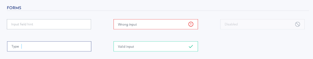
Use neutral colors (black, white, grey shades) for simple descriptions and secondary information that shouldn’t be prominent, for example disabled button statuses, inactive icons or form fields, and hints.
Interaction color
Define a prominent link color and use it consistently on every page in case of interactive elements and links (unless you need to define another color because it looks bad over a certain background color or the link would disappear on a background with a similar color). This helps the user to distinguish clickable (or tappable) elements from the non-interactive ones.
If you don’t want to use the link color too often, you can follow a common practice in which the clickable element itself has the color of your choice and the link color is revealed only in its hover state. For example, the link color can be used on the primary buttons’ normal state and the secondary buttons would, then, have a different, moderate color and only their hover state would have the link color. Of course, it is just a solution for using the link color in a hidden way, the secondary buttons can have a totally different style and color.
When you use clickable elements, we suggest defining a different look for their normal, hover, selected or disabled states and use it consistently on all pages. The difference can be another background or text color, but sometimes an underline (texts), a drop shadow, a border or size change (for example in case of buttons) is enough.
E.g. neutral grey indicates the normal state of a pager chevron UI icon, the hover and selected items have the link color, and the disabled state shows a lighter grey.
Utility colors
On developer portals, it’s useful to define utility colors and use them on various elements. Utility colors can give visual feedback emphasizing the element’s meaning and helps the cognitive processing of the information we see.
E.g.:
- Version numbers, releases,
- Messages (errors, warnings, updates),
- API statuses (e.g. prototype, beta, new, in progress, etc.),
- APP statuses (approved, new, revoked, pending, etc.),
- HTTP method types (GET, POST, DELETE, PUT, PATCH, OPTIONS, HEAD),
- Progress bars.
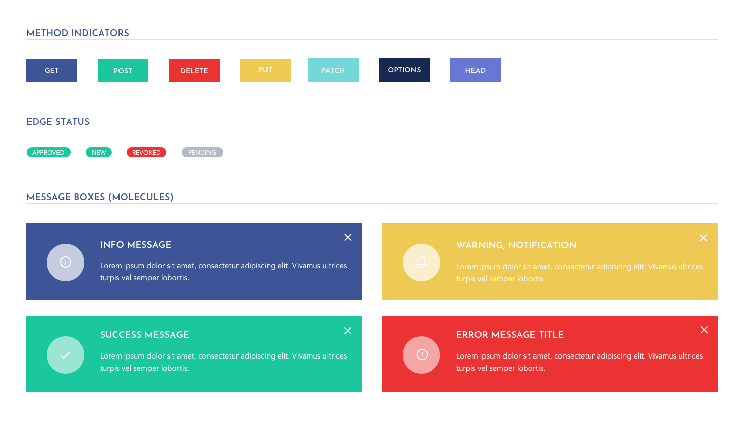
Colors affect human behavior, so choose them carefully: always think about possible meanings:
- Red is used for errors, potential danger, awareness (e.g. wrong input)
If the brand color is red, we suggest choosing a markedly different color or shade as an error color to avoid misunderstanding. - Yellow can be used for warnings and notifications.
- Green is the color of endorsement (e.g. valid input, approved status).
- Grey is used in neutral cases, on disabled elements or to communicate secondary information.
- You can use bright brand colors in Call-To-Action sections that you would like to stand out.
White space
Although white space is not an exact color, with proper white space usage you can visualize relations, separate / connect sections, or make specific sections more prominent.
You can use an additional background color for every second landing page section to make it clear where a section starts and ends. E.g. in tables it is a common practice to choose a different background color for the even and odd rows.
White space is an option. Some alternatives: section the content with divider lines, use box borders or shadows.
Accessibility
Accessibility is about more than colors, but you cannot create an accessible devportal without thinking about users with vision impairments.
- Choose the proper contrast ratio.
- Focus on the variation between background and foreground colors.
- Choose colors that will reach the contrast ratio minimums defined in the Web Content Accessibility Guidelines (WCAG) 2.0 standards.
- Look for Plugins for your designer tools that can help to make your devportal accessible.
- Use online accessibility checking tools, such as WebAIM.
Resources
If you don’t have a color palette yet, you can find tools and websites that offer aesthetic color combinations here:
With the HEX color tool, you can easily generate lighter or darker shades from a HEX color:
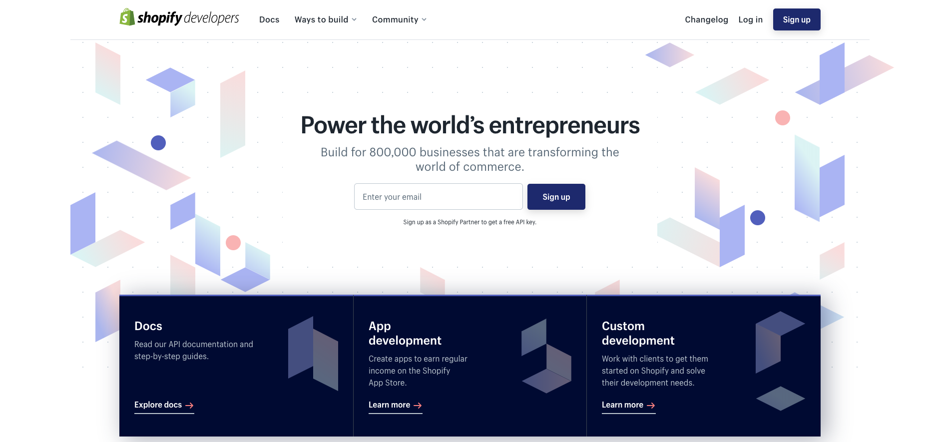
Imagery
Although developer portals are technical sites with a lot of documentation and text, there are plenty of ways to use imagery — you just need to keep a balanced visual-content-functionality ratio.
Here are some samples which can improve the look-and-feel of your devportal.
Photos
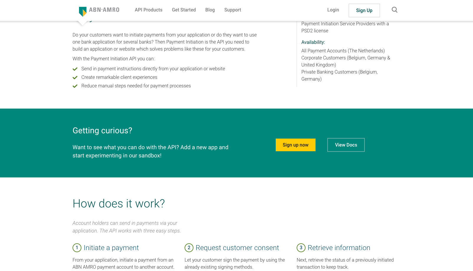
If we talk about imagery, the first things that usually come to mind are photos. Most companies have an image bank or a smaller stock photo collection. The simplest solution to make the site more appealing is using these aesthetic, brand-friendly photos.
We suggest choosing a theme first and then collecting the images that fit in. Some devportals use IT-related images that clearly refer to the keyword ‘development’: people sitting in front of a computer screen or in a meeting room. In this case, we suggest using images that look natural and not constrained.
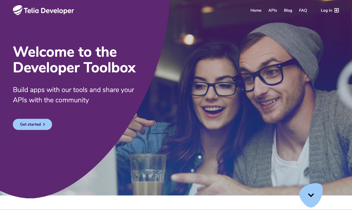
Other devportals use more playful, not directly work and IT-related images to break the monotony and give the site a fresh, friendly look.
Illustrations
You can make your site eye-catching with custom-made or purchased illustrations as well. Their main advantage is that you can easily adjust the colors to the brand color palette. The size of an svg animation is smaller than the size of a png or jpg image. svg animations are therefore perfect for web or mobile use and can be recoloured from code source files.
If you prefer unique illustrations, you might think about hiring a proficient designer or professional illustrator with the experience required for the job.
*Check our article: Overall Design Style (Actual design trend) for more illustration samples*.
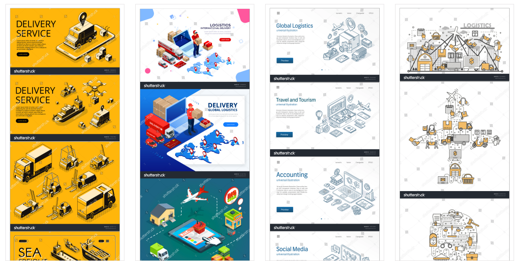
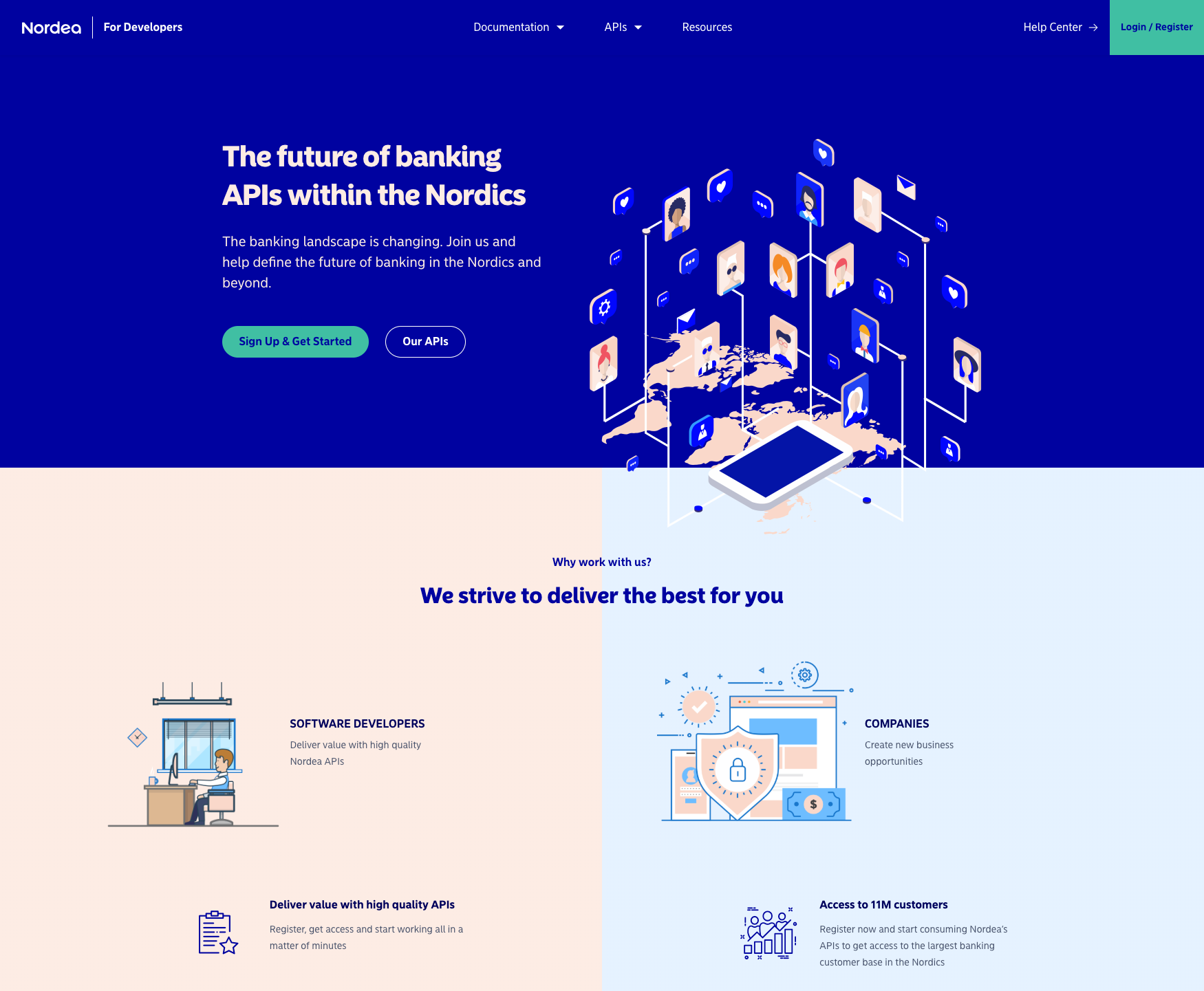
Abstract images, patterns
Nowadays, it is also popular for developer portals to use abstract images or patterns. These can be used prominently (in the Hero section) and/or in smaller amounts (in header or page title backgrounds, footer, on cards).
If you use a pattern as background it needs to be moderate: the textual content should be readable even when the size of the browser window changes.
Whichever type of imagery you use, don’t overwhelm your developer portal with graphics. Try to find a harmony in the amount and the arrangement. For example, insert a section with text to follow a section with images or use images on the left and images on the right alternately.
Resources
Useful articles about illustrations:
If you don’t have an image bank or brand image collection, you can find beautiful free or premium images, illustrations and patterns here:
Download:
- the photos in high resolution,
- the illustrations and patterns in vector format
so that they can be modified later.
Typography
Font pairing - Headings and main text
When we create the design of a developer portal —and we are not tied to a strict brand guide— we follow the “keep it simple” rule and use 3 font-families only. One for the headlines, one for the main, body text and one for the code samples.
Dóra Jankai, designer at Pronovix:
Aesthetical font-pairing can highly improve your design. We suggest choosing an easily legible and simple typeface for your main text (e.g. Montserrat, Open Sans, Roboto) and select a noticeable, more special one for your headings. Don’t forget, legibility is always the main goal! This method can help to distribute your content and to create a nice visual structure.
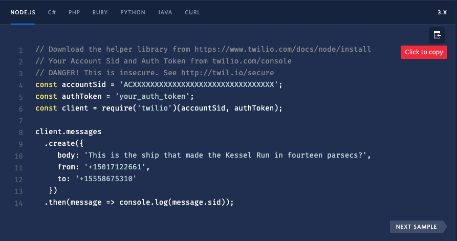
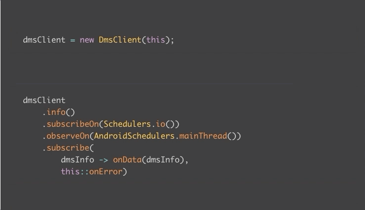
Codes
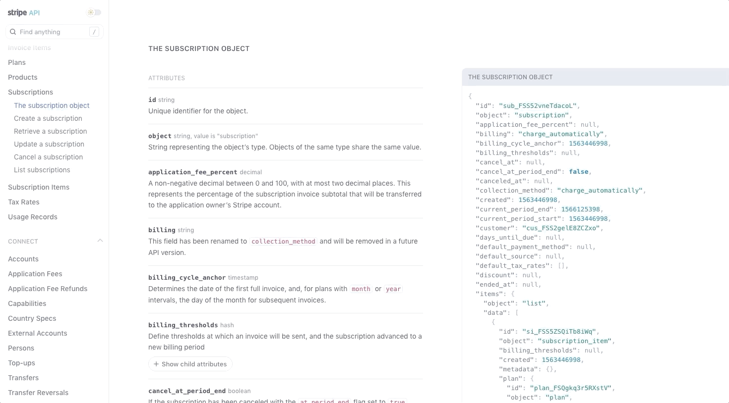
For the code text we advise to choose a well-readable code font (e.g. Anonymous pro, Source code pro, Droid sans, Menlo, Consolas) and a prominent background color that stands out from the text. Our goal is to enable developers to scan pages: it is a must to find code snippets quickly.
Other solutions that help the visual processing of code snippets are row numbering and a syntax highlighter that colors the code according to syntax, which makes it easier to read and understand it.
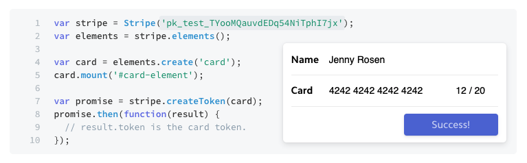
A copy button can help to copy the code easily.
Basic typography rules
Consider:
- Choose a font-family with different weights. It can be beneficial to vary the font-weights to create a hierarchy in the text.
- Use different font sizes to give structure to the text.
Use a bigger, bolder font size for titles and headlines, a smaller but easily readable font size for the main text (around 16 px), and a small (12+ px) font size for the less important side information, like metadata, dates, breadcrumbs, etc. - A well-chosen line height improves readability,making it easier for the eye to follow the text rows.
- Avoid long rows and wide sections: they make it harder to find which row comes next.
- A right contrast ratio between text and text background improves readability.
The tool Colorable helps to try out how a text color looks on a certain background color.
The following devportal specific suggestions can help to establish a transparent text structure and improve readability:
- Provide users with the possibility to change the font size when needed (e.g. while reading the documentation).
- Use different text formatting on content-heavy pages. Style the basic text elements, such as links, lists, quotes, code samples, etc.
- Avoid typefaces that contain indistinguishable letterforms in code sections that appear frequently, e.g. take care of using the number 1 and capital “i” or number 0 and letter O.
- Image overlays and text shadows help to make the text more readable when the background is a crowded or colorful.
-
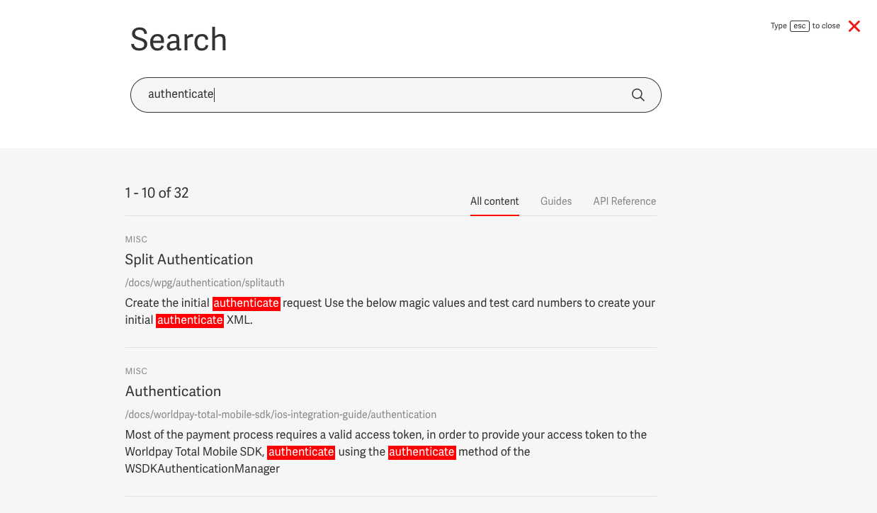
Highlight the keywords in the text on a search results page.
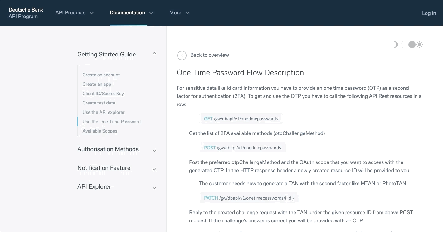
- Add a day and night mode switcher. This allows users to choose between a light or dark background color according to light conditions around them or according to their taste. The dark background will put less strain on the eyes at night, while the light version improves the readability during daytime.
Resources
If there is no brand font, we suggest choosing a well-readable, free Google font which has at least a Regular and Bold font-weight version and can be used as a web-font.
These Google fonts can be easily embedded into your webpage.
An other option is to purchase a unique font and use that:
What is next?
In our next article we’ll give some tips that help to improve the developer experience and the usability of your developer portal. How can you make a devportal more transparent and understandable but also friendly and playful at the same time?
Developer Portal: Design Guide Series In this series you will learn about common design patterns, get an insight into Pronovix' project work related experience, and learn how we tackle the design of a developer portal user interface.

