In this article we discuss:
- Why are terms and conditions important?
- Why do users ignore the terms and conditions?
- How to enhance terms and conditions to raise end-user trust and conversion?
- How to handle changes in terms and conditions?
- Conclusions
Why are terms and conditions important?
We all meet terms and conditions (often called "terms of use" or TnC) day after day. Long, difficult legal texts regularly interrupt us when we are in the middle of an important task. While we as users might find them a disturbance, they are an essential part of business, legal contracts, and online processes. Our job as designers and developers is to make the terms and conditions better and easier to use. An easily understandable and usable terms and conditions generate trust from the user, who will be more cooperative in accepting it.
When designing for the terms and conditions, we have to take into consideration two distinct types of users - the developer portal end-users and the business owners.
- End-users are users who are presented with the terms and conditions as they interact with the developer portal or API.
- Business owners are responsible for provisioning the terms and conditions.
Terms and conditions are required for registering with a portal, signing up to access an API, purchasing an API subscription, or accessing an API key through a gateway. To achieve this, the terms and conditions texts are often displayed in full, with a design forcing end-users to scroll through or to spend a fixed amount of time on the page before accepting.
Terms and conditions may be hard to find at a later date with no links available for a user to come back and review what they have hastily agreed to. Users are prompted to sign before they can proceed with their desired action. Terms and conditions are difficult to consume by the user when they are written from the business owner's perspective. An end-user is looking for trust signals to convince them the contract is in their favour and that they can sign it without reading. Conversely, they put less emphasis on the legal framework in their limited time pursuit to get to the APIs. A business owner is looking for smooth user conversion. Both parties are ultimately looking to avoid legal pitfalls.
Most often, the UX of terms and conditions is poor. End-users sign the terms and conditions with little trust or understanding of what they are agreeing to simply because it is a requirement to get access to what they require: the API or interface on your devportal. To understand how to enhance the terms and conditions to benefit users, we must first investigate why end-users do not read them.
Why do users ignore the terms and conditions?
Have you ever accepted a terms and conditions document without reading it? I certainly have, many times. But if avoiding legal issues is in our best interest, why do we ignore reading terms and conditions?
Blocking
Most of the time, we are doing something important to our goal - subscribing, purchasing, developing. In many cases, terms and conditions pages come up during our activity, as a reaction to our steps. Such terms and conditions are definitely blockers which stand between us and our goal. After all, we are not there for the legal text, so we just skip and push on.
Repetitive
Terms and conditions can be recurring which means they block us again and again. They are everywhere, even when we would not expect them. We rarely see the use of those because there are rarely any legal troubles. So, if it is repetitive and useless, skip it. We might read one or two, but after that, all are the same.
Hard to find
There are cases where the terms and conditions are not outright presented to us, and we do not have to accept those particularly. In other cases, we are facing and accepting terms and conditions, but after the acceptance, those disappear from us. In both cases, there is a problem with finding terms and conditions if we might need those. And if it is hard to find, why would we waste time looking for it?
Lack of interest
Terms and conditions regularly deal with personal data security. While the topic is important, particularly in the European Union, where there is a strict General Data Protection Regulation (GDPR) in effect, end-users rarely show deep interest. Data security is a new phenomenon, and most of the users are unfamiliar with it, and the dangers of personal data security breaches.
In case of accident, break glass
Furthermore, terms and conditions only matter if something goes wrong. Either the end-user breaks the contract, and has to face the consequences, or the business side missteps and causes problems. While this is serious for the end-user, the situation occurs so rarely, that the users barely focus on it.
Long and tedious
When we are focusing on a goal, the terms and conditions are a frightening, long, and unstructured document that is blocking us. We are ready to read a short warning or summary, but do not have the time when faced with a long and difficult text. Even when we are interested in a specific section of the content, we have to skim the entire text to find it.
Difficult language
Terms and conditions documents are not the easiest to read. These are legal texts, often containing legal jargon, complex sentences, and difficult grammar. Even if we were to spend time and effort to read, the language of terms and conditions are not familiar to us.
How to enhance terms and conditions to raise end-user trust and conversion?
Both the end-users and business sides are interested in having easy-to-use, smooth terms and conditions experiences, and strong trust signals. We also know why users tend to ignore terms and conditions documents, which weakens trust and increases legal risks.
By enhancing terms and conditions, we can create better experiences and stronger trust to increase user engagement and prevent users from abandoning the process. There are two aspects of how to enhance terms and conditions - the clarity of the document itself, and the design of the interaction.
Clarity of the document
Language and formatting
Try to use simple, plain language, and avoid complicated sentences and difficult grammar. If possible, prefer common terms instead of legal or technical jargon. Pay attention to the font too, follow general online readability and accessibility guidelines, use sufficient line spacing, include bulleted lists. Try to avoid too much formatting, a simple bold format is usually enough.

Good versus bad example of text layout for easy-to-read, well-organized terms and conditions content.
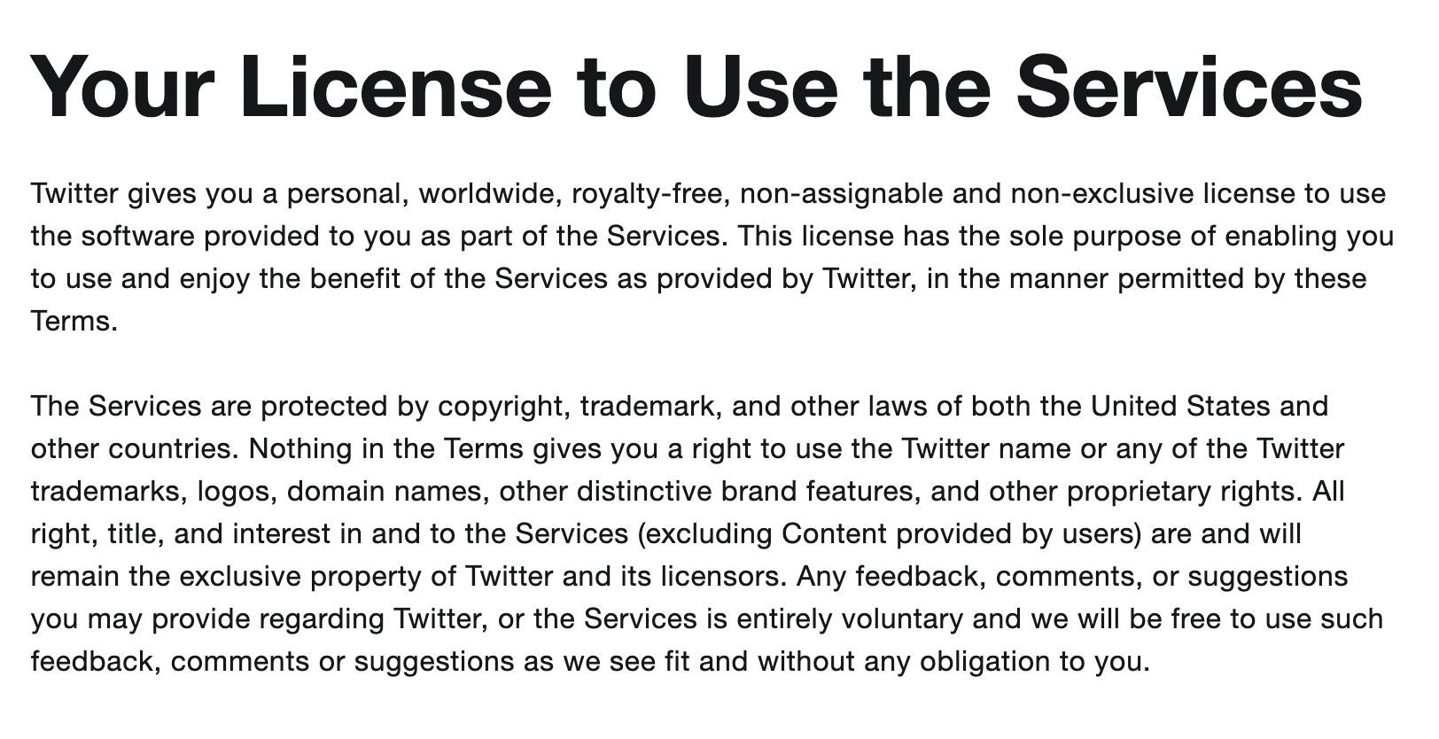
Good example for text, ample whitespace and line spacing.
[Twitter Terms of Service, https://twitter.com/en/tos]
Structure and hierarchy
By grouping and structuring information we can create clarity. The users will find what they are looking for faster, and we can decrease confusion. They will have an easier time navigating if every paragraph is dedicated to one single topic or idea. Try to create a clear, consistent hierarchy, and use different heading levels. This also helps accessibility and search engines.
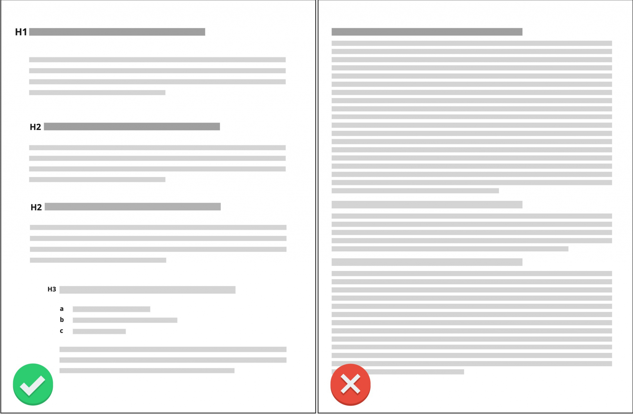
Good versus bad example of hierarchy levels, bullet points, whitespace.
Navigation
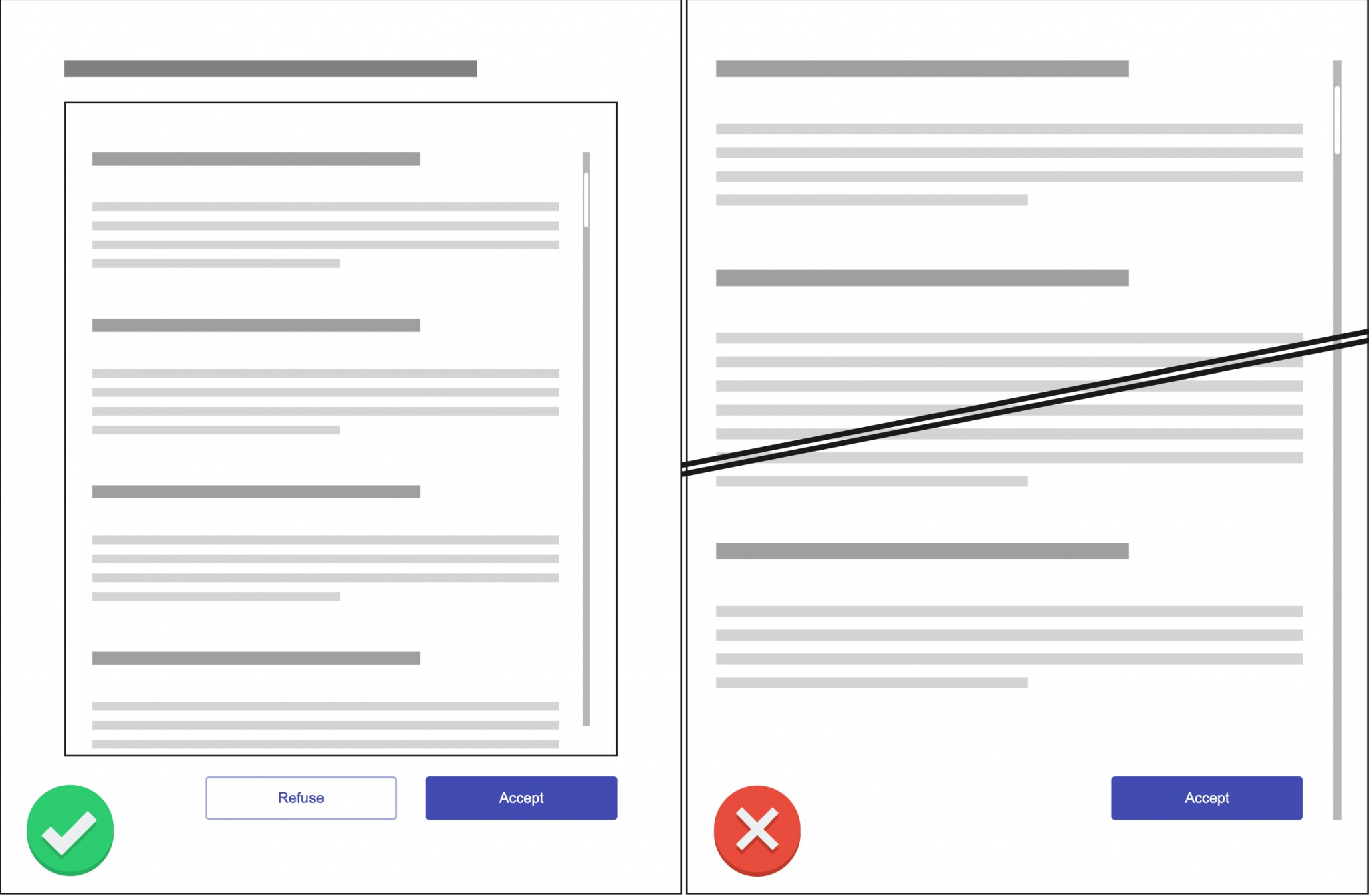
A simple, well-maintained table of contents, based on a good hierarchy, is an easy-to-use navigation tool which lets users explore the document. It is a commonly used design pattern which is familiar to users, further helping discovering content.
If the terms and conditions document is long, or has some specific content not organised to its own paragraph, a search bar is a good solution to let users find what they are looking for.
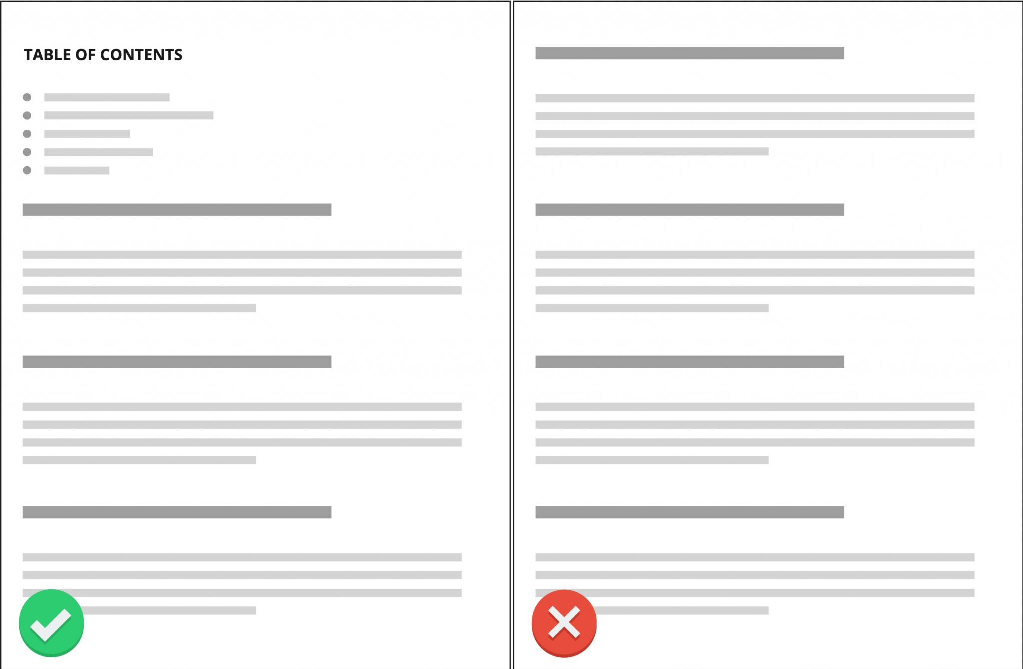
Good versus bad example of navigation, table of contents, optional jump links.
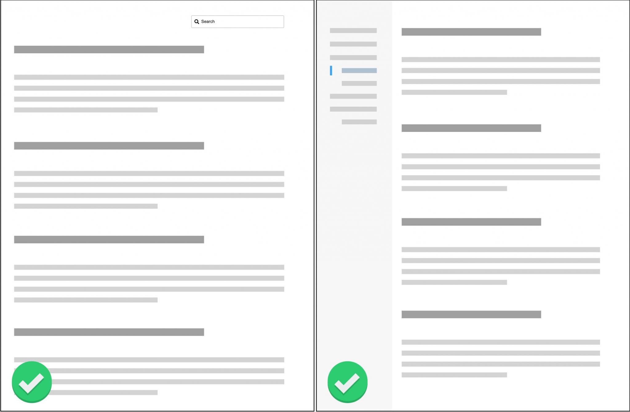
Further good examples of search field and sidebar navigation.
Short extracts
Similar to blogs and news articles, emphasising some of the key content is a great way to help users quickly understand the core message. Try to find the most relevant sections, and extract those with some visual help, such as quotation marks, a frame, or an icon.
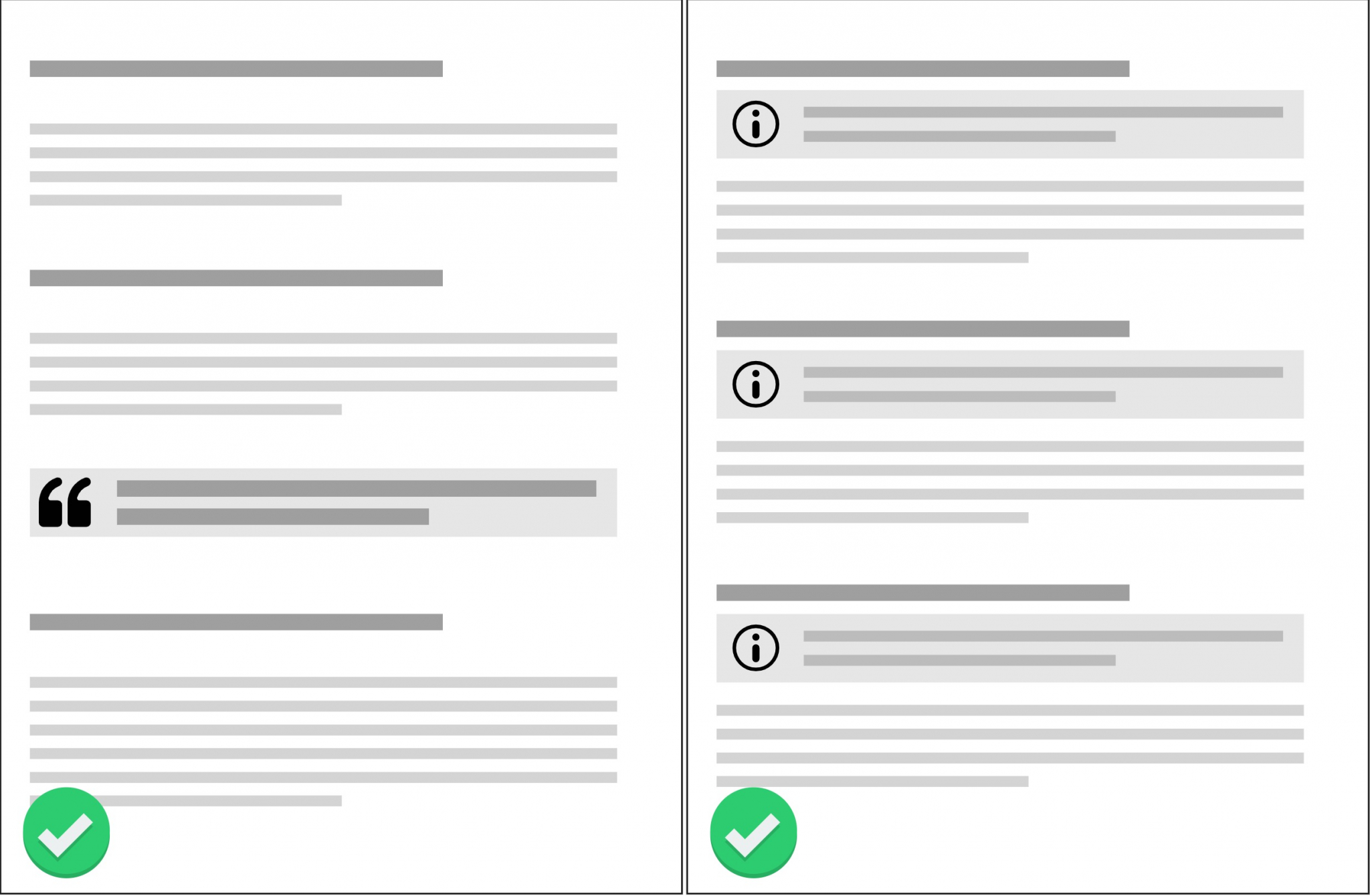
Good examples of short extracts, news article style for the most important content, and intro explanations for each section.
Extra explanation
While some content is considered core message, other parts of the document might need further, detailed explanation. To avoid cluttering the text with lengthy explanations, try adding pop-up information bubbles when something, like a legal phrase, needs extra clarity. This solution is also valuable if a legal section can be rephrased in a simple manner, but we do not want to break the flow of the original text.
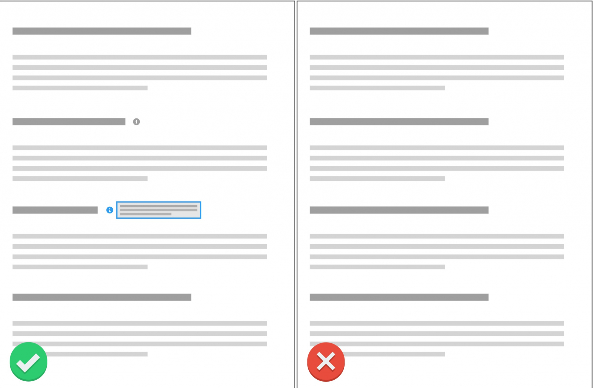
Good versus bad example of extra explanation, on-demand info with text bubble on hover.
Fitting content
The terms and conditions document of a company should be tailored to that very company. While there are some generic terms and conditions available, just as like any other generic products, these are prone to mistakes and confusions. Try to have your own terms and conditions document, and pay attention to make it fitting to your product and site.
Visuals
When possible, try to use visual aids, such as flow diagrams, screenshots, or illustrations. Keep in mind that these should help understand the legal text, and are not there for mere decorative purposes. A well-placed visual can help users understand complicated ideas or complex technical steps. Keep in mind that the visuals need alternative texts for accessibility, and that the image itself should not contain information that is otherwise unavailable.
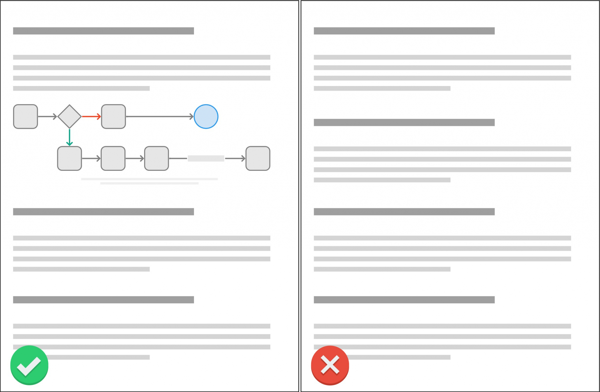
Good versus bad example of visuals, flowchart with caption and alt-text, ideal for explaining complex processes.
Up-to-date content
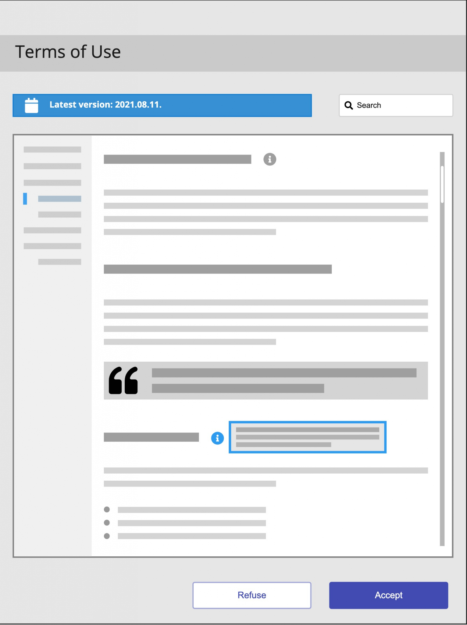
Trust is an essential value in the case of terms and conditions. Users need to know if the documentation they see is valid and up-to-date. By showing them when the terms and conditions were last modified, and if they are looking at the current version, we can build trust and avoid confusion.
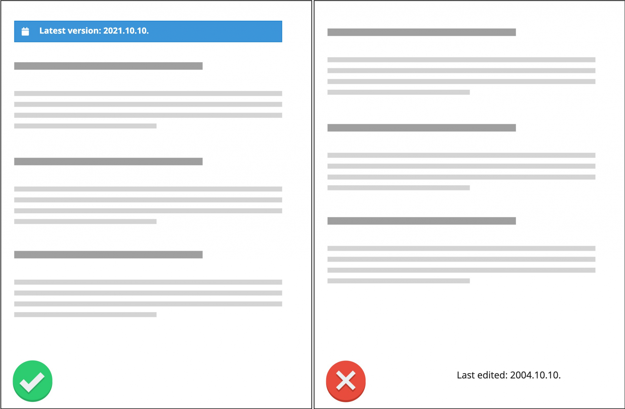
Good versus bad example of usage of date, up-to-date content, easy-to-spot visual.
Design of the interaction
Convenient and quick
The time the users spend on legal documents and terms and conditions interactions is not part of their ideal journey. They want to achieve some goal, and terms and conditions are a blocker to that. We should aim to design convenient, easy-to-use, quick interactions to minimise the user effort. Try avoiding unnecessary interactions, make every step reactive and clear, and allow users to make their own pace. No matter if they want to read the document in all details or skim through it, they should be able to do it.
Good example: long text is scrollable within a frame, user is not forced to scroll to access CTA. Bad example: long page with lots of scrolling to reach the CTA at the end.
Simple to understand
Not only the actual terms and conditions document should be using plain language, but the interaction dialogs too. The users should always understand in advance the consequences of their actions, and the next steps. We should not put mental burdens on the users. Try to use well-known patterns, clear call-to-actions, simple texts, ample visual signs, and be generous with white spaces.
Avoid generic, unassuming titles, try to use definite, specific titles which clearly and quickly inform the users about where they are and what they are doing.
If several pieces of information are shown at once, it is best to organise those in an easily understandable way. This might be a chart, a list, or a sectioned arrangement. If the interaction is long, try dividing it into steps and let the users pace their progress.
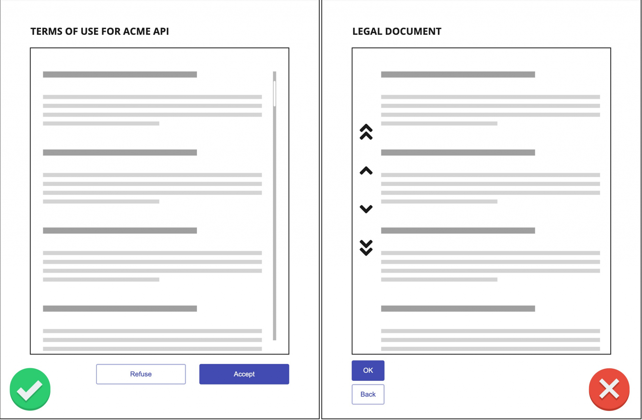
Good versus bad example of simplicity, definite title, familiar industry standard controls, no novelty solutions.
Contextual and modular
Terms and conditions shall be presented to users when and where it is important. We should use contextual interactions, which appear in the right spot when a user does something consequential. Keep in mind that the best way to keep the user within their flow, and to decrease unnecessary interruption is to start terms and conditions interactions immediately after a user action. This can be a purchase, a selection of a product, or signing up.
If a given terms and conditions flow has conditional sub-elements, make it possible for the users to interact one-by-one with these. This is something we can often observe in many cookie policies too. Try to use on/off switches or checkboxes to let your users pick which parts they agree to. Of course, this cannot be applied to every terms and conditions, and we are aware that a modular interaction is much more complicated for the users and the legal team too.
Failsafe
At the end of the day, terms and conditions are important legal documents, and we should treat those as such. We should leave no room for error, and users should always be able to revisit their previous choices to alter their decisions. On the other hand, users should not be able to avoid the terms and conditions interaction - this is where the blocking nature of the terms and conditions make sense.
Try to use words and visuals that are simple to interpret. The user should always be well aware if they are accepting or rejecting a terms and conditions document, there is no room for confusion here. Using immediate feedback, warning messages, and deactivating unavailable buttons help a lot to minimise errors.
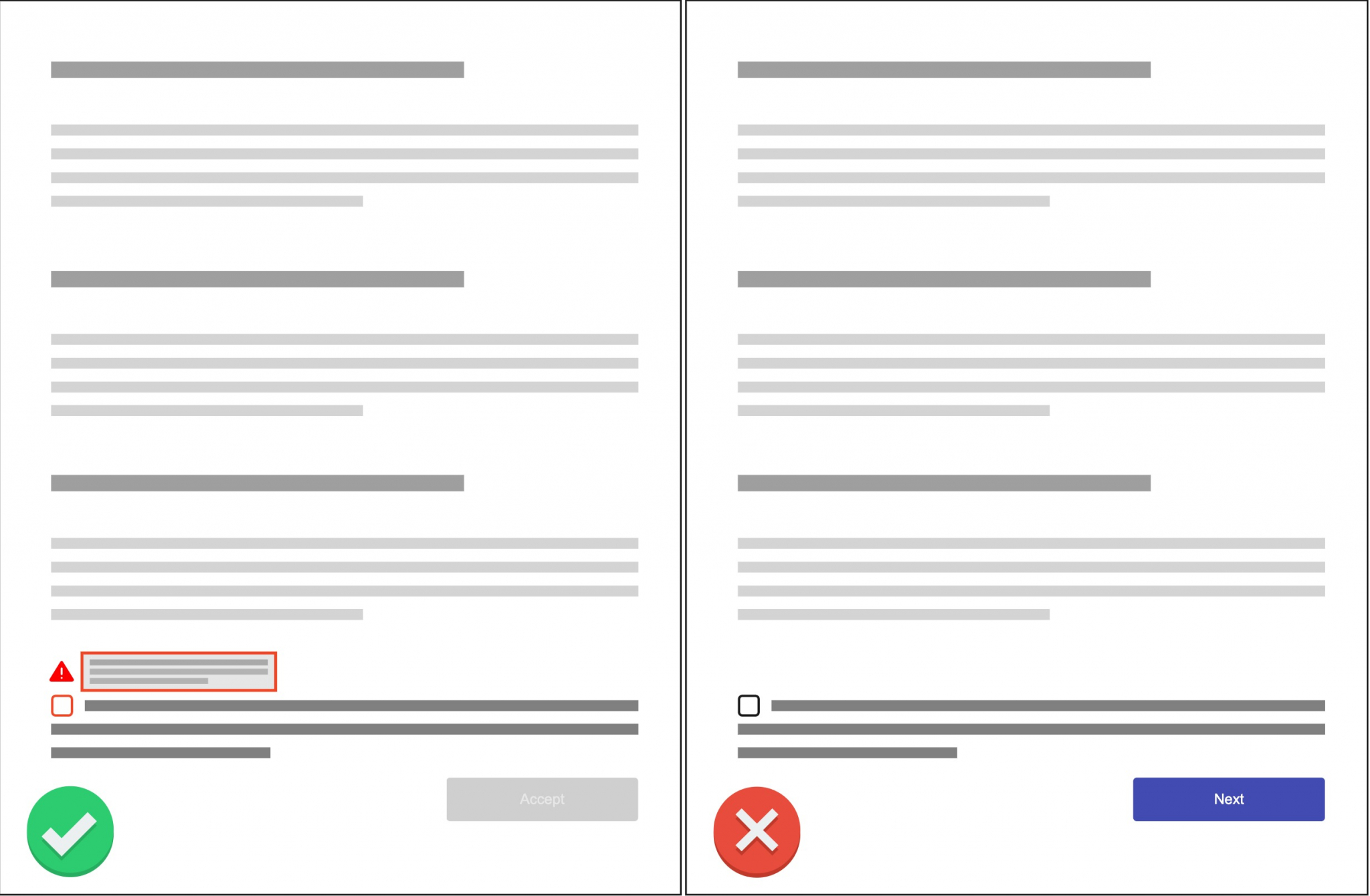
Good versus bad example of failsafe working: CTA is inactive while checkbox is unchecked, user is given visual and written feedback
Modal dialog
While designers often avoid using modals because they can be disruptive, blocking interaction types, in the specific case of terms and conditions interactions this is exactly the benefit. A modal overlay blocks every other action, and the user has to either accept or reject the terms and conditions. This flow reduces the chance of errors, and emphasises the importance of the terms and conditions document.
Good example of modal solution: anything outside of the modal is inactive, users cannot interact with anything but the modal.
Summary of important methods to enhance the TnC
As a summary of the previous paragraphs, it’s important to pay attention to:
- copy (plain language, short texts, good font, short extracts, text hierarchy),
- structure (one paragraph is one idea, information hierarchy, sub-headers, table of contents),
- purpose (up-to-date, fitting to given business, contextual, modular),
- navigation (clear language, visuals, searchability, feedback, warnings),
- interaction (convenient, simple, failsafe).
Good example of terms and conditions: the content is well structured, easy to navigate, there are extracts and additional explanations available, the content is up-to-date.
## How to handle changes in terms and conditions? {#link4}
What to do when we have to change something in our terms and conditions? If possible, this should always be an actual legal change, changes without legal meaning and reason are best to avoid. A legal change might often mean that the users have to accept the terms and conditions again, or in certain cases, their user interactions can even be blocked until they do so.
In short, tell your users that a change is coming, what is changing, why it is happening, and how it will affect them.
Communicate
As simple as it sounds, communicate. Aim to notify users well in advance that a change is coming, let them learn about the nature of the change. Tell them what is changing. Try describing in advance how the change will affect your users, particularly, if they will be limited until they accept the new terms. Use multi-channel notifications, such as emails, social media posts, and on-site warnings.
Also, right before and after the new terms and conditions are in effect, try to use banner notifications on your site to make the changes clear for every user.
Explain the reason
Users might be curious about the reason for the change, and telling them why you decided to modify your terms and conditions is a strong trust signal. Try to use simple, easily understandable descriptions, and avoid legal jargon. If there was an incident behind the change, be honest about it without going too much into details.
Show the effect
If users understand what and why is going to change their frustration might be much lower than without telling them in advance. But the most important question is how the changes will affect them. Try giving them actual examples. Show them what the change means for their usual use cases and user journeys. Let them know the consequences of the rejection of the new terms and conditions too.
Conclusions: how to do terms and conditions?
Terms and conditions are an important part of our business processes. An easily understandable and usable terms and conditions generates trust in the user, who in turn is more likely to accept it.
However, most of the terms and conditions we have are blocking the user’s workflow, are long, tedious, full of complicated legal phrases, and seem like a burden instead of an integral part of the process.
So, how to enhance your terms and conditions?
- Keep the clarity of the document
- Use simple language and clear text
- Use clear structure and hierarchy
- Make navigation easy and quick
- Add short extracts and extra explanations
- Pay attention to use fitting, appropriate content
- Design easy-to-use interactions
- Make the acceptance flow convenient and quick
- Make sure the user understands what are the consequences of their actions
- Make the interactions modular if possible
- Make sure the interaction is failsafe and cannot be avoided
How to handle changes in your terms and conditions?
- Communicate with your users well in advance
- Tell them what is changing, when, and why
- Show the effect, let your users know how it will affect them
Developer Portal: Design Guide Series In this series you will learn about common design patterns, get an insight into Pronovix' project work related experience, and learn how we tackle the design of a developer portal user interface.