FAQ
- What kind of layout is the most common on developer portals?
- Is there a suggested layout for devportals?
- Are there design patterns that help understand the site and improve the overall usability?
- What design solutions help users not to get lost in a huge amount of code and documentation pages?
- What design solutions make it easier to navigate the devportal?
Experience and advice
3-column layout
“If your API documentation isn’t huge, go with a single page design that lets users see the overall structure at first sight. Introduce the details from there. Long, single page docs also make it possible for readers to use the browser’s search functionality.”
(Taken from: The ten essentials for good API documentation)
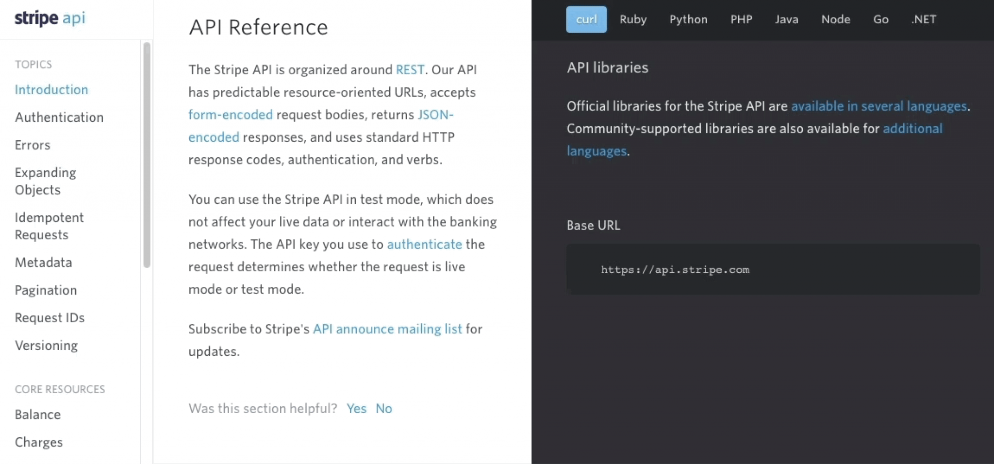
The advantage of the 3-column layout is that the user can find everything on one page. The documentation is more transparent because the code snippets are nicely organized in the 3rd column, in line with the corresponding textual descriptions. This 3-column layout can be beneficial if a developer portal has lots of code samples.
But when a portal doesn’t have that much code samples, the 3rd column is almost empty. In this case, it might be a better solution to integrate the code snippets into the textual description, drop the 3rd column completely and use a 2-column layout: the 1st column is for the sidebar navigation and the 2nd is for the code samples and their descriptions.
This way the portal doesn’t have an empty column on the right side and the column of the textual content - which was hard to read before, because of the lack of space - can be wider, giving it a bigger focus and improving the readability. Large tables also appear in these technical descriptions and those also look better in a wider size.
If you prefer the 3-column layout on desktop, you’ll have to deal with the fact that this splitting needs to be changed on tablet and mobile devices. The 3-column structure is optimized for desktop, but it won’t work the same way on smaller screen-widths. You have to rethink the place of the sidebar navigation on the different devices and figure out different layouts according to the smaller space to obtain the best user experience and more efficient space consumption.
You can find some samples and solutions in our article about responsiveness.
Centered layout
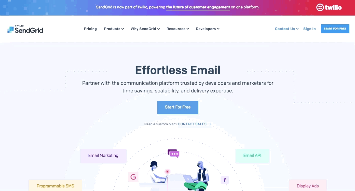
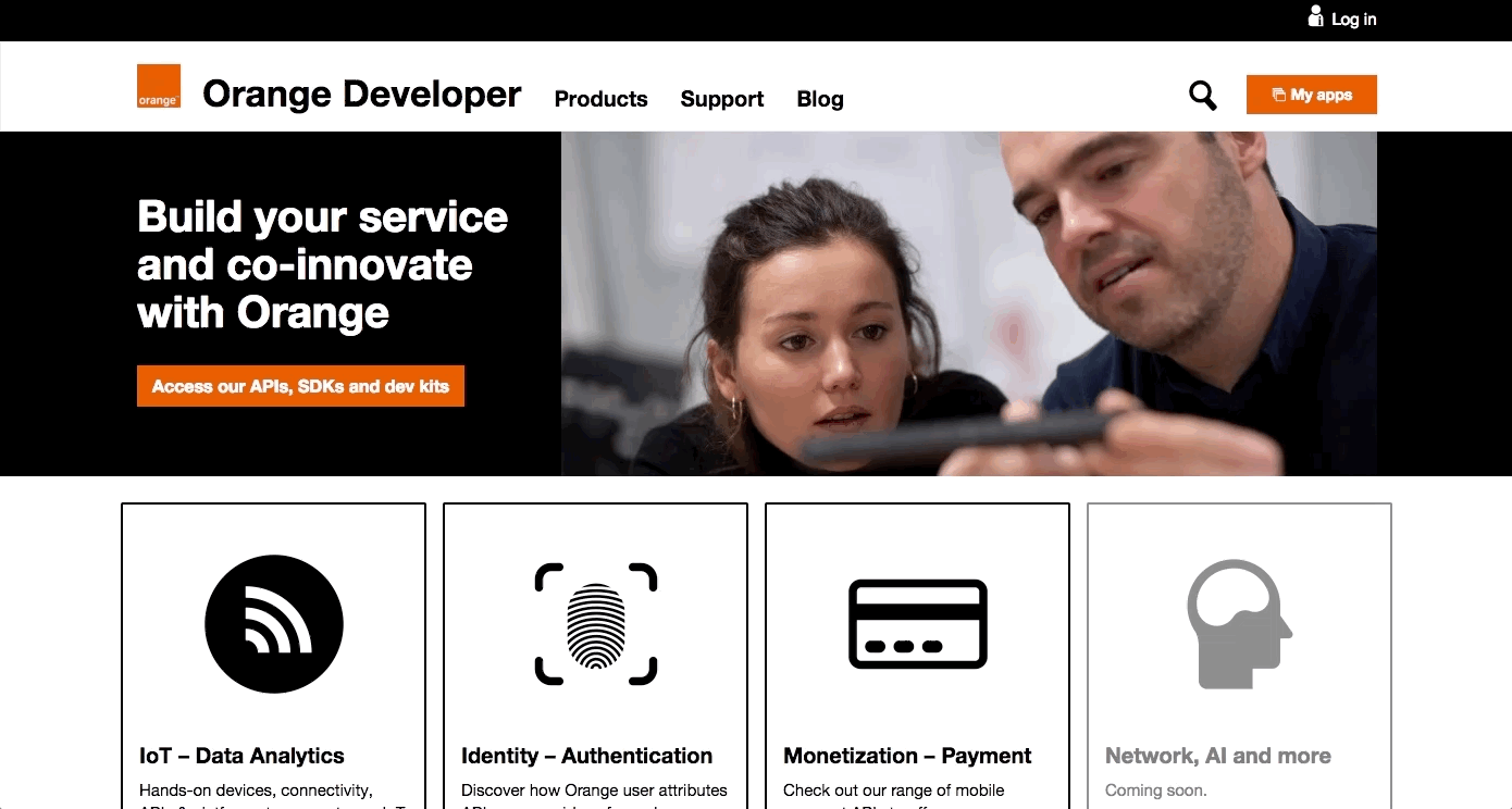
Most developer portals use a responsive, fluid, centered layout with some full-width and centered sections.
On these sites, the content of the different sections is aligned to the center. Some sections have a full-width background that spreads from the left side of the screen to the right side, but the content inside them is centered. The content inside the sections can be arranged in different splittings, for example 1 or more columns, ⅓ - ⅔, ½ - ½ parts etc.

This layout is a great solution because it can adapt both to the really big and small screen widths. You don’t have to create different layouts for smaller devices, as the section order will stay the same if you resize the window: only the content, the boxes inside the sections shrink or drop under each other on smaller screens.
If you increase the screen width, the centered sections start to grow according to the new width, but they don’t grow indefinitely. On large screens, after a given width - usually around 1200-1400 px - they become centered and only the white space (which can be a background color or an image too, not just the plain and boring white color) is growing on the left and right sides of the page.
Examples:

Navigation
Whichever layout you choose, the navigation has to be visible at all times. Users don’t want to search the whole page for the hiding navigation.
Some suggestions from us to solve this:
- Use a top navigation, and when the user scrolls down, add a “Back to top” button to the pages, which helps users to quickly navigate back to the top of the site and reach the navigation bar.
- Use a fixed sticky navigation, which always stays at the top of the page and this way it is reachable all the time.
- Use a sidebar navigation that is either fixed or openable-closable. This could work on desktop and smaller devices as well.
Examples:
Also, consider that users can land on any page of your devportal. The following information should be clear for them anytime:
- Where am I?
The navigation should be visible and we suggest highlighting the actual menu item. Use a page title and breadcrumbs. - Where can I go next?
Provide suggestions, related content boxes, links to related docs, previous and next buttons, pagers and breadcrumbs. - How can I go back?
For example by clicking on the logo, which leads back to the home page, or using a breadcrumb which makes it clear where users are in the content structure.
Further devportal layout suggestions
Use the most common industry patterns based on developer experience.
Use a left sidebar for navigation if the main menu is not enough, if the content structure is deep and the navigation has to be organized hierarchically (for example documentation pages).
In case of 3-column layout, use the widest, middle column for the main content and descriptions. It is also remarkable that the Swagger UI —that contains schemes, method lists, models, wider rows and code blocks, tryout sections and openable and closable elements— needs a wider space so it should be placed here (for example API descriptions).
The right sidebar - if any - is mostly kept for additional, secondary information, like code examples, related content, information messages, and useful links.
Emphasize the primary information on every page and keep it in focus.
Design closable sidebars or provide the possibility to open parts of the page in fullscreen mode (e.g. code snippets, examples, statistics, illustrations, tryouts). Use only the most important components, for example sticky navigation, as fixed elements.
We suggest using a 12 column grid setting, as it is flexible, it helps responsiveness and it easily breaks up into a different number of columns, 6, 4, 3 and 2.
On pages with more text, we might need more space for the content and we use only 2 columns in various splittings:
- Technical documentation page (e.g. guidelines, get started page, conceptual docs): ⅓ for sidebar navigation and ⅔ for textual content.
- Reference page: ¼ for a small inpage navigation which quickly scrolls down to the different swagger parts and ¾ for the swagger).
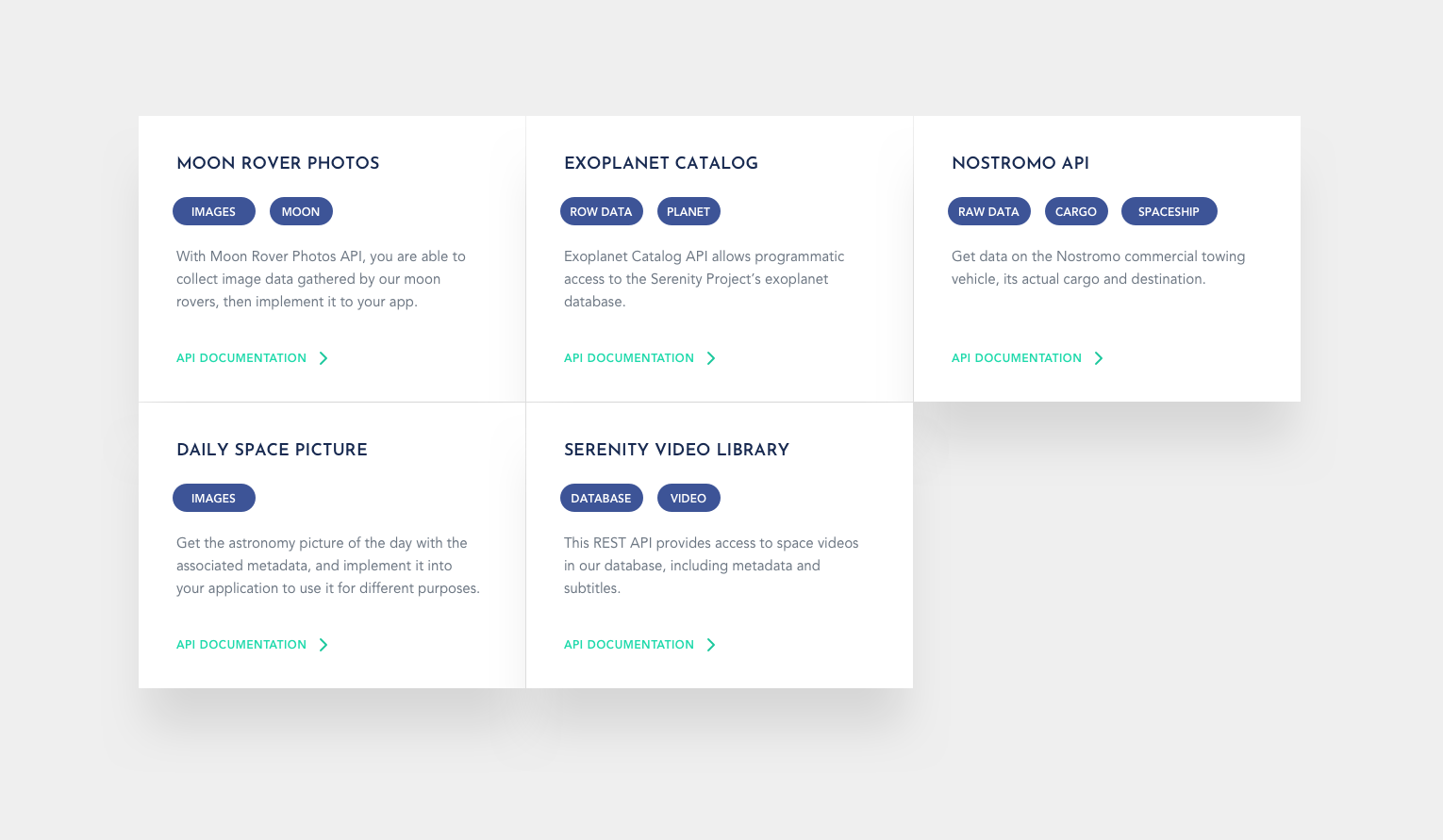
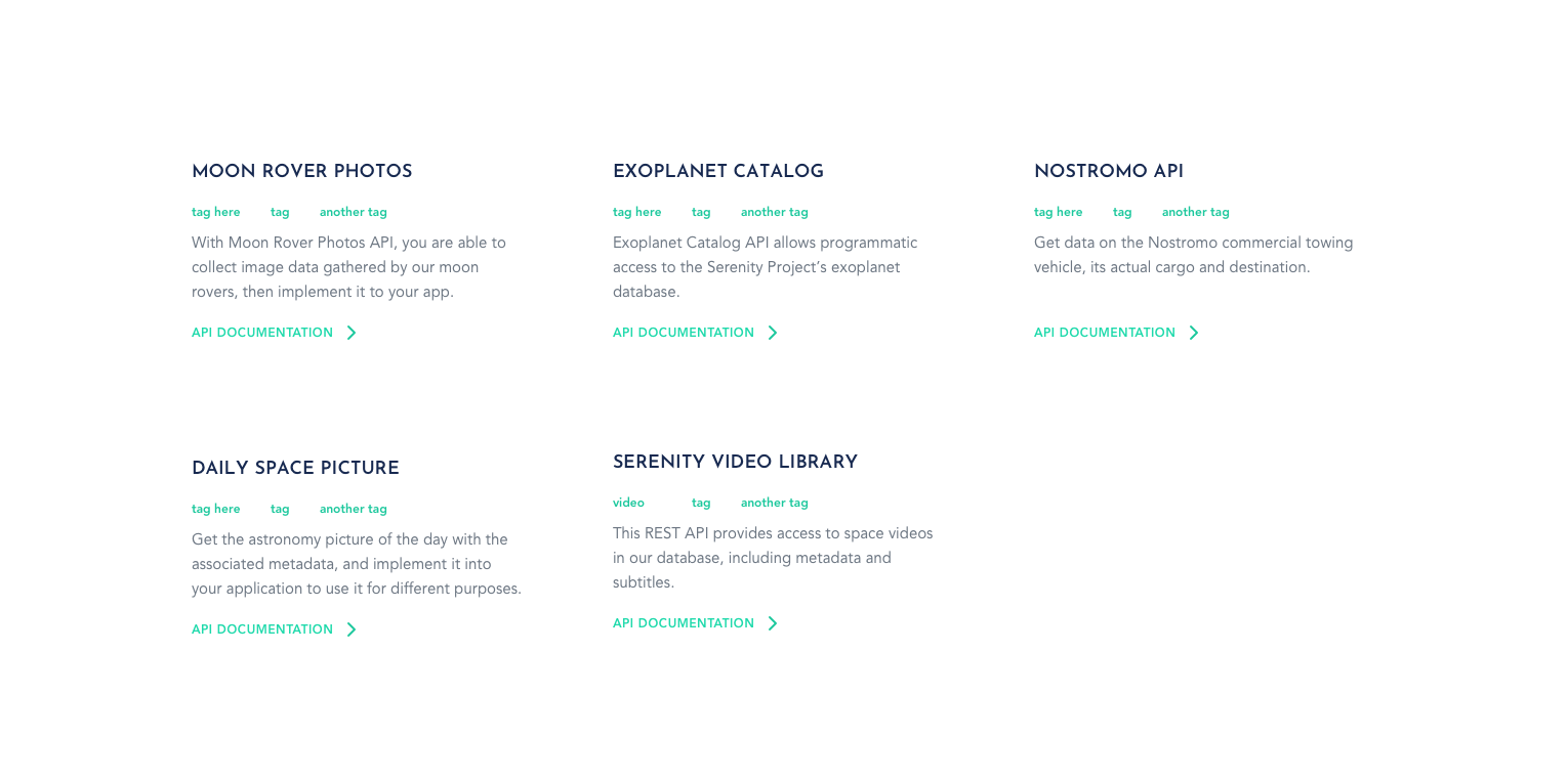
- Other pages with evenly distributed repetitive page elements (like cards, boxes) can use 3 - 4 columns depending on the amount of content appearing on them (for example API catalog pages with numerous API cards or blog listing pages with summary cards).
Use white space to visualize relations.
Use paddings and margins between the different content sections, around and inside boxes to group the related visual elements and distinguish them from others. White space is not wasted space, it makes things stand out. It helps to prioritize and organize content elements, but also to establish hierarchy. If you use white space properly, you might not even need visual elements, such as borders, boxes, background colors to differentiate which parts belong together. It will be visually clear.
“White space” should not be always white, it can be a solid color, a fine gradient, texture or a blurred background too.
We hope that this article:
- provided you with hands-on samples for the most common devportal layouts, listing their advantages and disadvantages, and
- will make it easier to choose the most suitable direction for your organization when you plan your developer portal’s structure.
What is next?
In the upcoming article, we will write about the actual devportal design trends and brand consistency. We will also point out the importance of proper aesthetics, content and functionality ratio, which can help you to create a beautiful but also handy developer portal that enhances usability and developer experience.
Developer Portal: Design Guide Series In this series you will learn about common design patterns, get an insight into Pronovix' project work related experience, and learn how we tackle the design of a developer portal user interface.

