Overall Design Style of Developer Portals
Breadcrumb
- Home
- PronovixBlog
- Overall Design Style of Developer Portals
Similarly to the way trends change year by year in web design, the preferred visual styles of developer portals also change. Nowadays, it is really popular to use illustrations in certain page sections. These colorful, aesthetic illustrations can spice up the, dry, technical content and pages and give a nice first impression.
These illustrations appear on several pages, consistently with the same graphical style and color scheme but in different amounts.
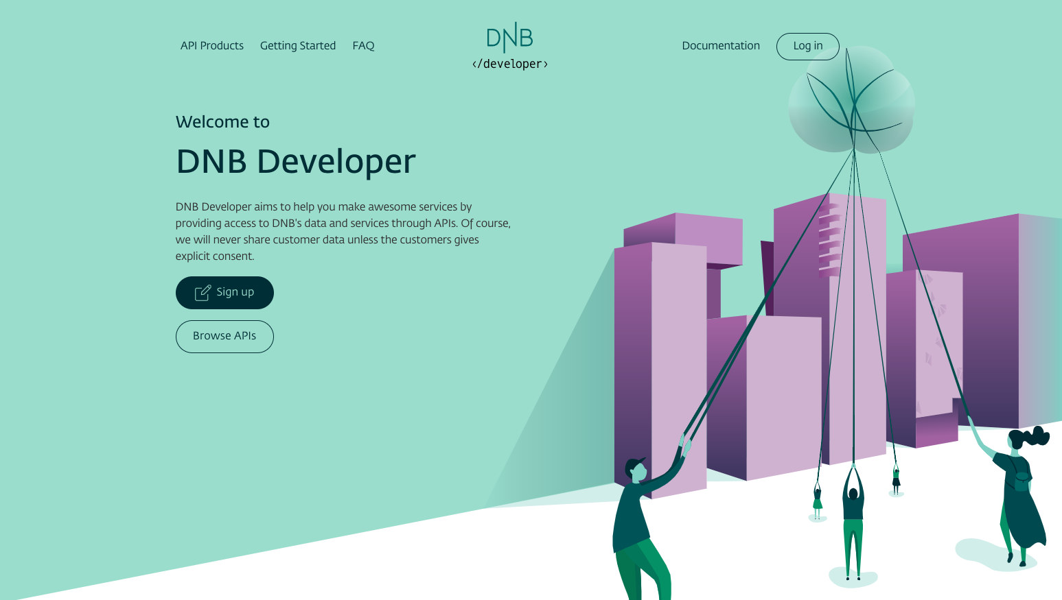
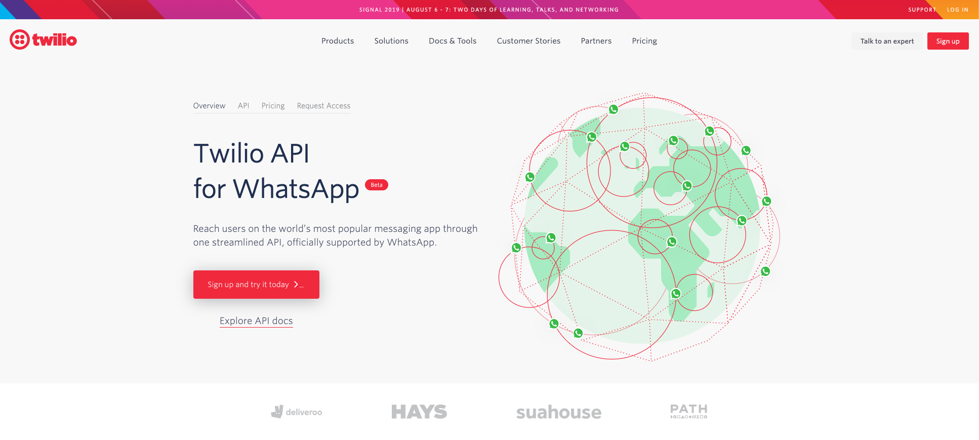
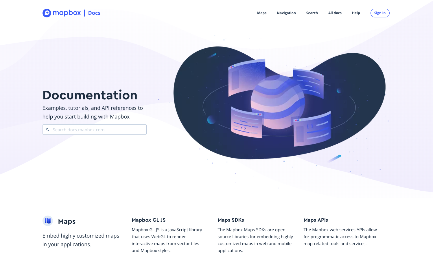
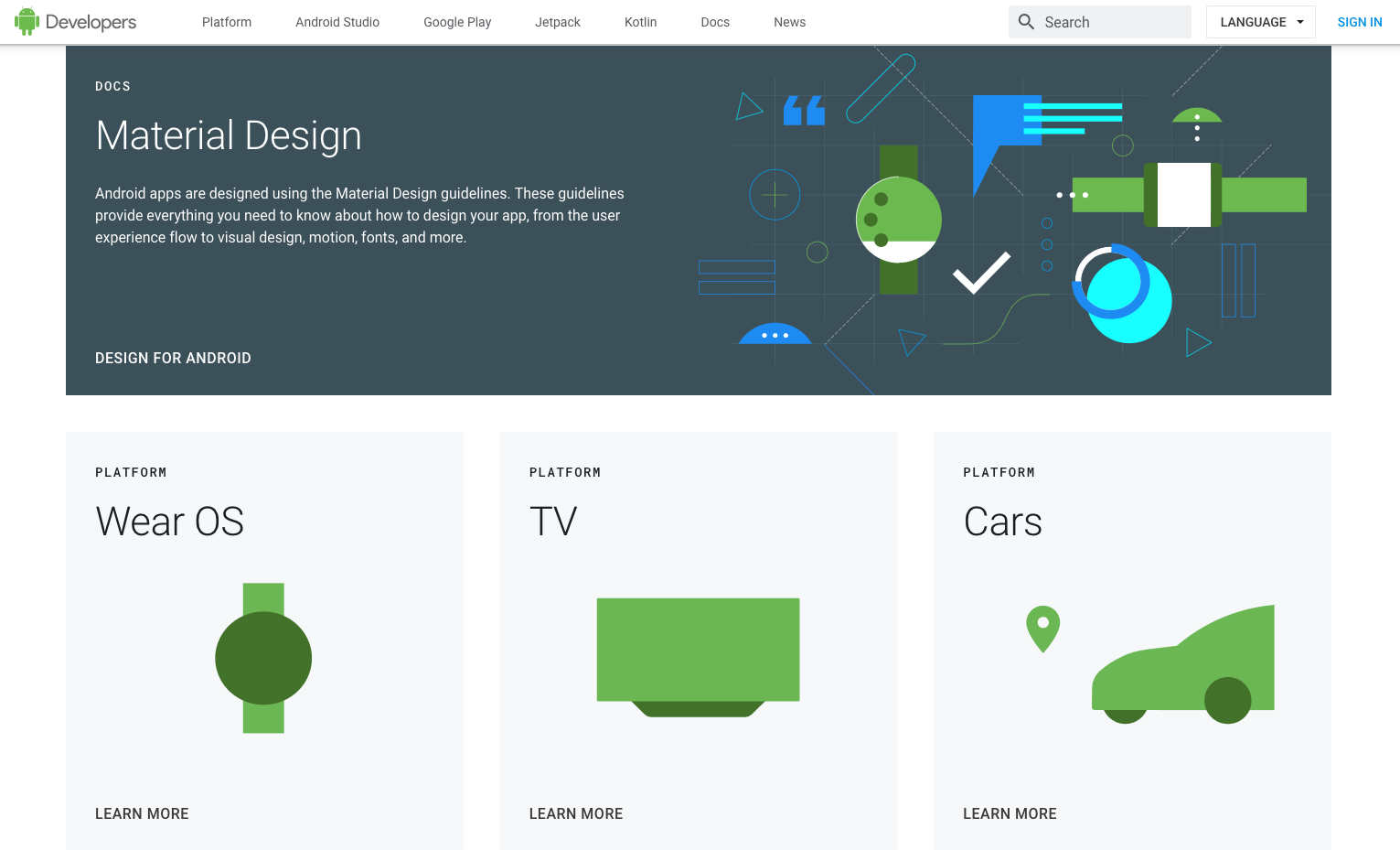
You can read more about illustrations in part 4: Supporting graphical elements.
It is possible and suggested to play with appealing images and illustrations, but you have to keep in mind that a developer portal —just like any other product of a company— should reflect the brand. Not just the colors and typography but the imagery should follow the brand rules as well. To ensure this designers always start with reading the brand book carefully and adjust the visuals to that.
Besides being compliant to the brand, the design should also be consistent through the pages, This means the same graphical style, icon style, brand colors, box styles, etc. on all subpages.
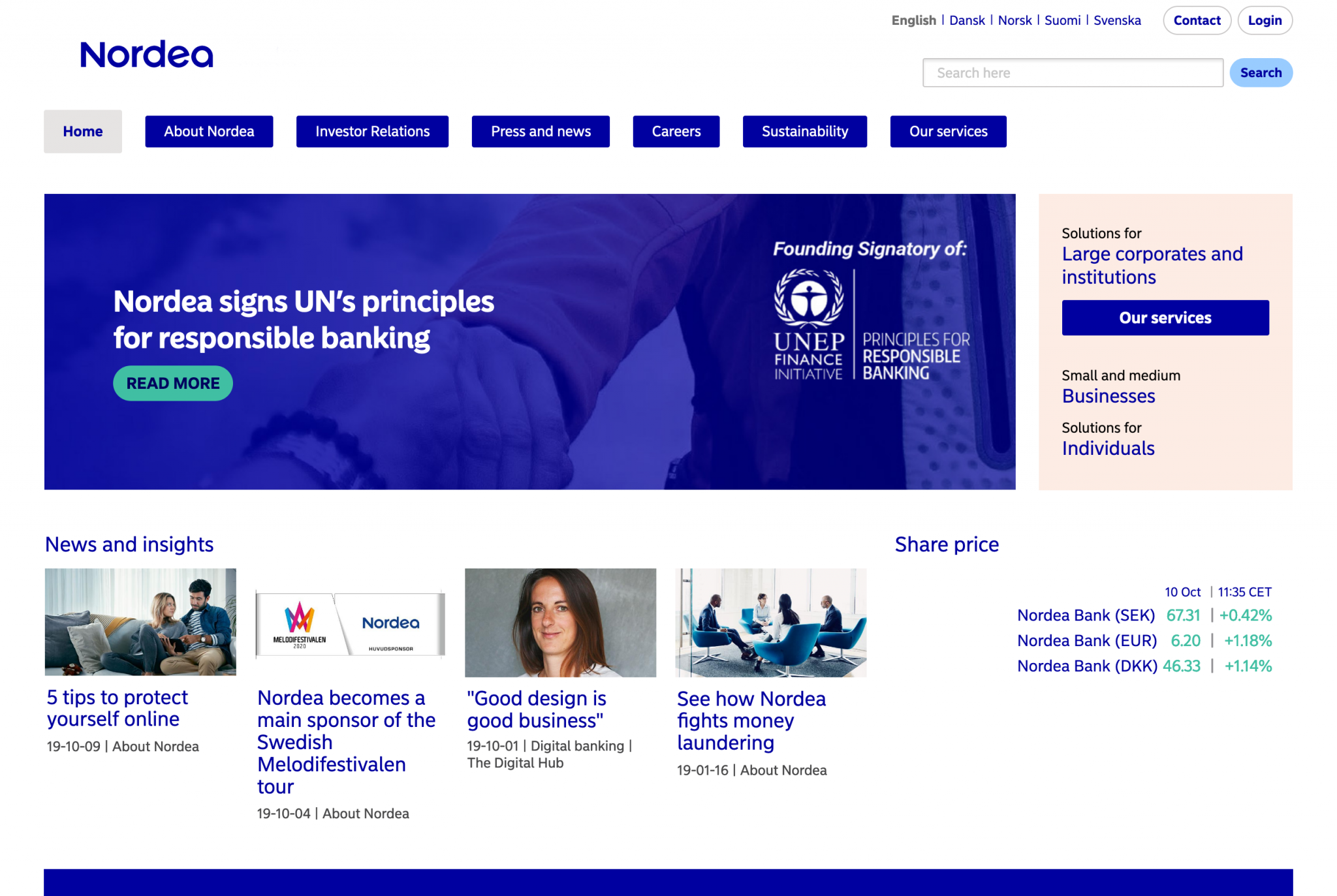
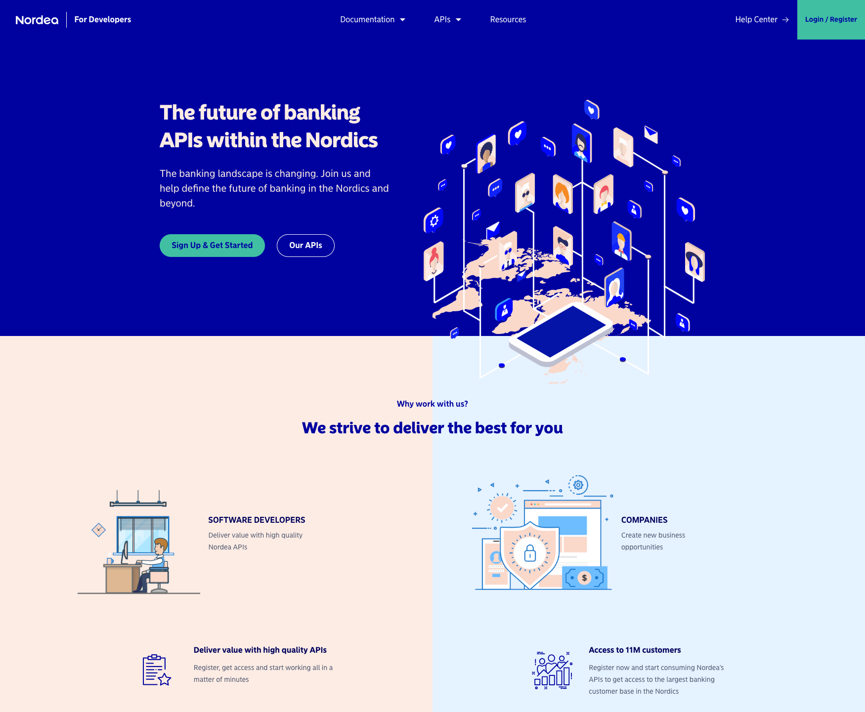
Having said these, the developer portal can be just different enough from the company’s corporate site to make sure users realize that they are not on the corporate site. This difference can be reached with a logo version, just like in case of divisions or business units. It is a common practice to use the main brand’s logo with a text next to it saying: “Developer Portal” , “API store” , “Developer Center”, or “Documentation”. It comes in handy if the developer portal’s header or footer contains a link or button which leads back to the corporate site.


The distinction between the corporate site and the devportal can be reached with different colors as well. For example, it is a popular solution to use one of the primary or secondary brand colors -—but not the main primary color— on the developer portal as a dominant color. It is also common to choose different imagery styles on the devportal, for example, use photography on the corporate site and illustrations on the devportal. Just like on the Nordea sample above.
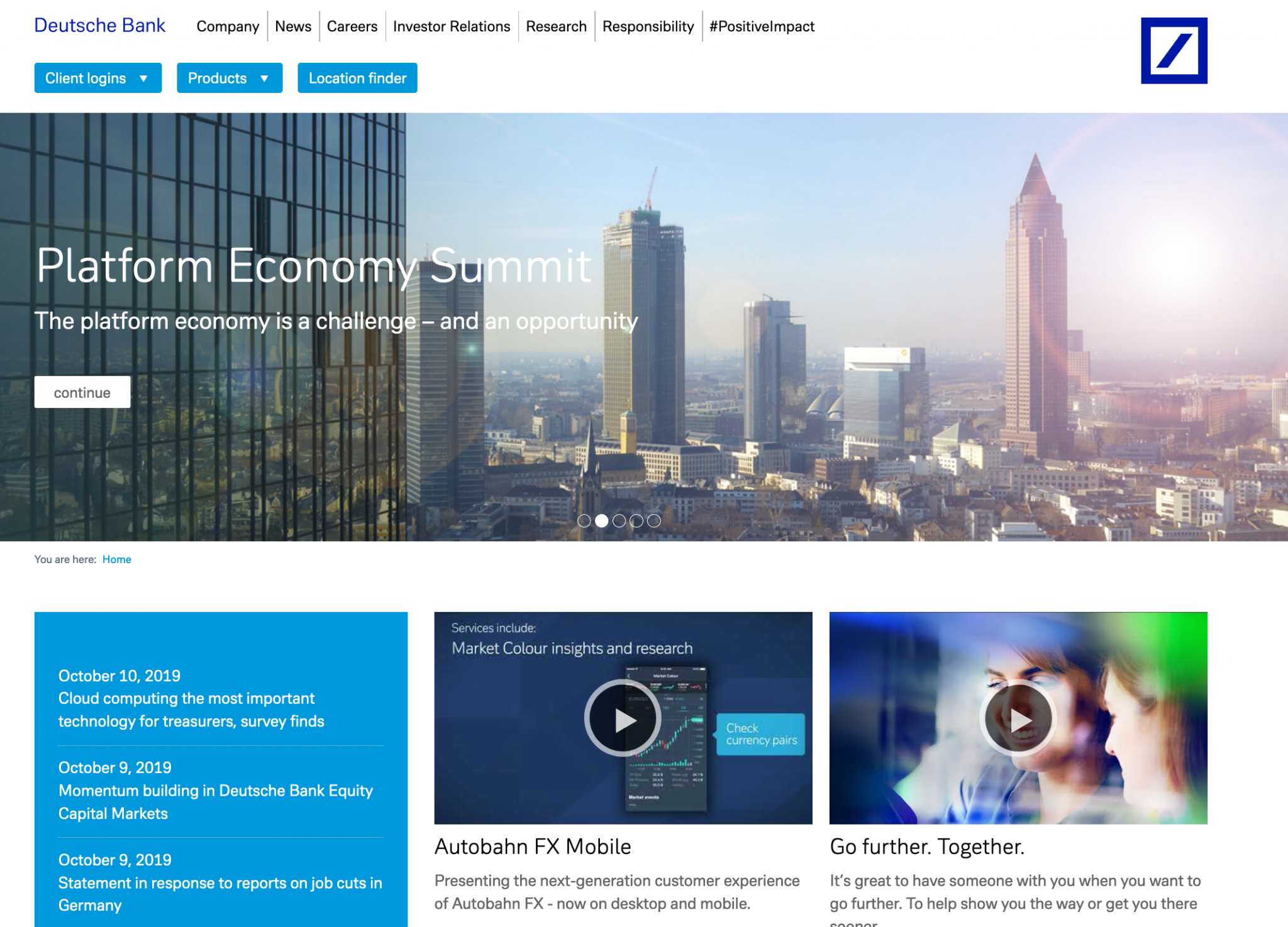
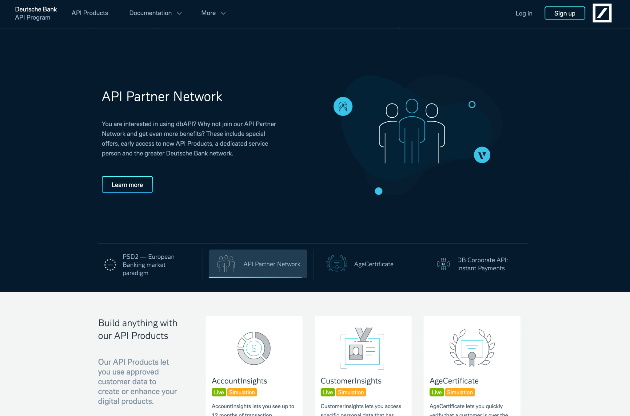
The layout and design of the whole developer portal should focus on functionality. It’s not a commercial, marketing page, it has a different goal and target audience. A developer portal contains and organizes a huge amount of information, code and documentation. For a developer portal clean, transparent, functional design can provide the best user experience.
In the case of developer portals, the main goal is to find the balance between visuals and content, and focus on functionality and usability. From outside the portal should be brand-consistent and appealing, while from inside it needs to be easily understandable and usable. We can reach this by changing the amount of visuals as we dive deeper into the IA.
We suggest keeping the design clean, simple and minimalistic on inner, technical pages (e.g. documentation, Swagger UI). However, visual elements on landing or API summary pages - marketing focused descriptional pages with various sections, CTAs, cards, etc. - can give users a nice first impression. You can improve these visually by using colorful, brand-consistent graphics, images, illustrations, backgrounds, even videos or gif animations (e.g. tutorials, how-to parts). You can also play with the size and arrangement of the sections. On these engaging pages don’t hesitate to use bigger hero sections with pretty pictures, prominent CTA sections. The main goal here is to onboard users and direct them.
On the more technical subpages a smaller header and clean style is more advantageous. You can still play with white space, element grouping and typography in order to show hierarchy.
You can use graphical elements here as well, but you have to keep in mind that these should support functionality and content. The documentation, code samples and textual content should be given the greatest focus so don’t overwhelm these pages with graphics.
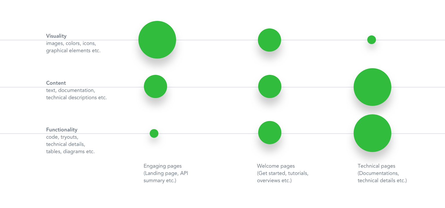
Examples from TomTom and Twilio devportals that reflect this ratio:
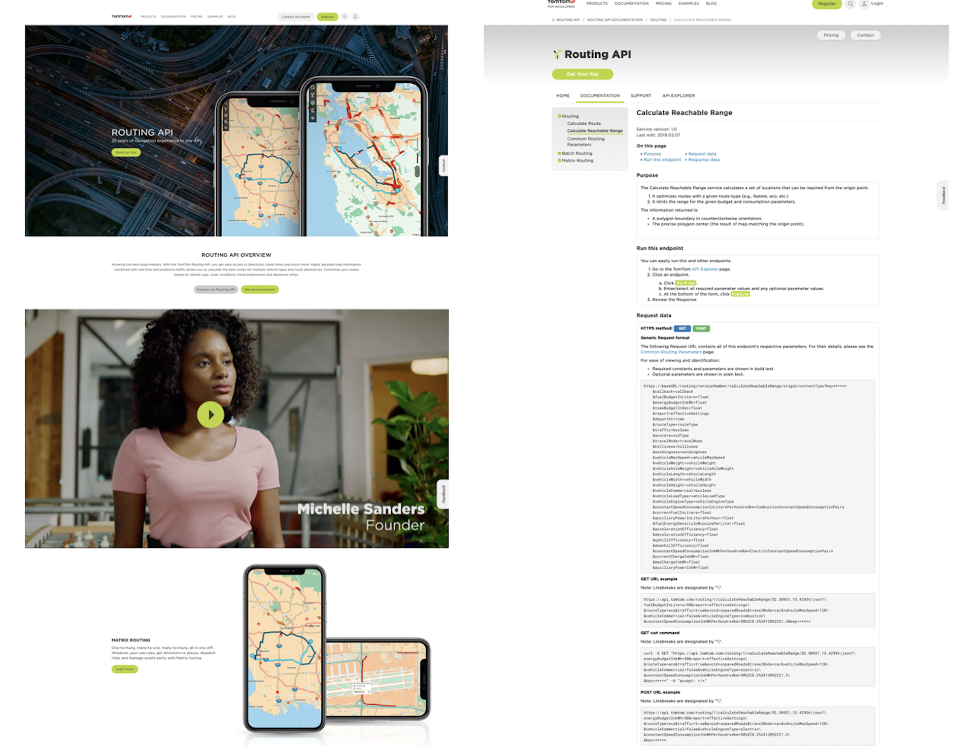
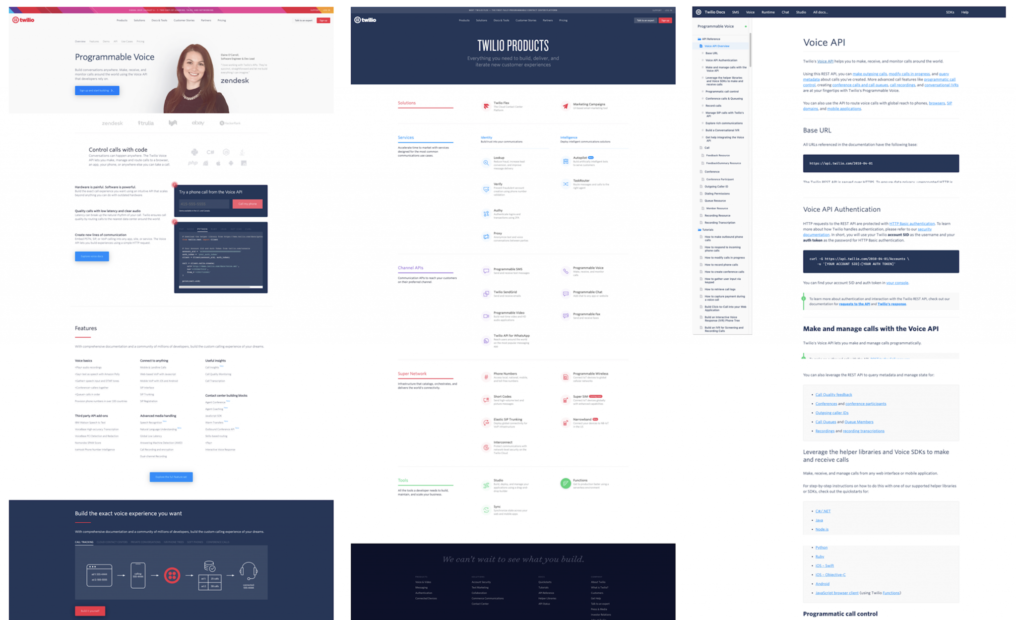
We hope this article provided you with ideas about the visual style and mood of developer portals and gave you useful examples about the balanced amount of visuals on various pages, such as marketing, documentation, and technical pages.
What is next?
In our next article we’ll look into what viewpoints you can consider when you use basic graphical elements on developer portals, such as icons, colors, images, and fonts. How can these elements make a devportal more friendly, aesthetic and organized? What is important to keep in mind, how can the elements support functionality?
Developer Portal: Design Guide Series In this series you will learn about common design patterns, get an insight into Pronovix' project work related experience, and learn how we tackle the design of a developer portal user interface.

Gyöngy is a Senior Designer. She enjoys working with UX researchers, developers and content writers to find the best visual interpretation of an idea. Although she is passionate about design, she likes to maintain balance between design, functionality and content.
She graduated as a computer program designer and specialized in image processing. This IT background helps her establish an efficient workflow between the design and development phases of projects.
Before entering the company she has worked as a webdesigner and mobile application designer, so she has been working as a designer altogether for 10 years now.
Articles on devportals, DX and API docs, event recaps, webinars, and more. Sign up to be up to date with the latest trends and best practices.

