Visual Solutions to Improve User Experience of Developer Portals

Senior Designer
Oct 23, 2019

FAQ

  • What visual solutions (apart from the ones in our previous posts) can contribute to a better user experience?
  • Should you use animations on a developer portal?
  • How can you make API cards look better and how can you differentiate categories visually?
  • How can you make a developer portal more understandable and transparent?

Solutions

Interactions, micro animations

Too many animations can have a disturbing effect on your users: they might lose focus when concentrating on moving elements instead of focusing on important content. Functional micro animations can help to improve the user experience.

Examples:
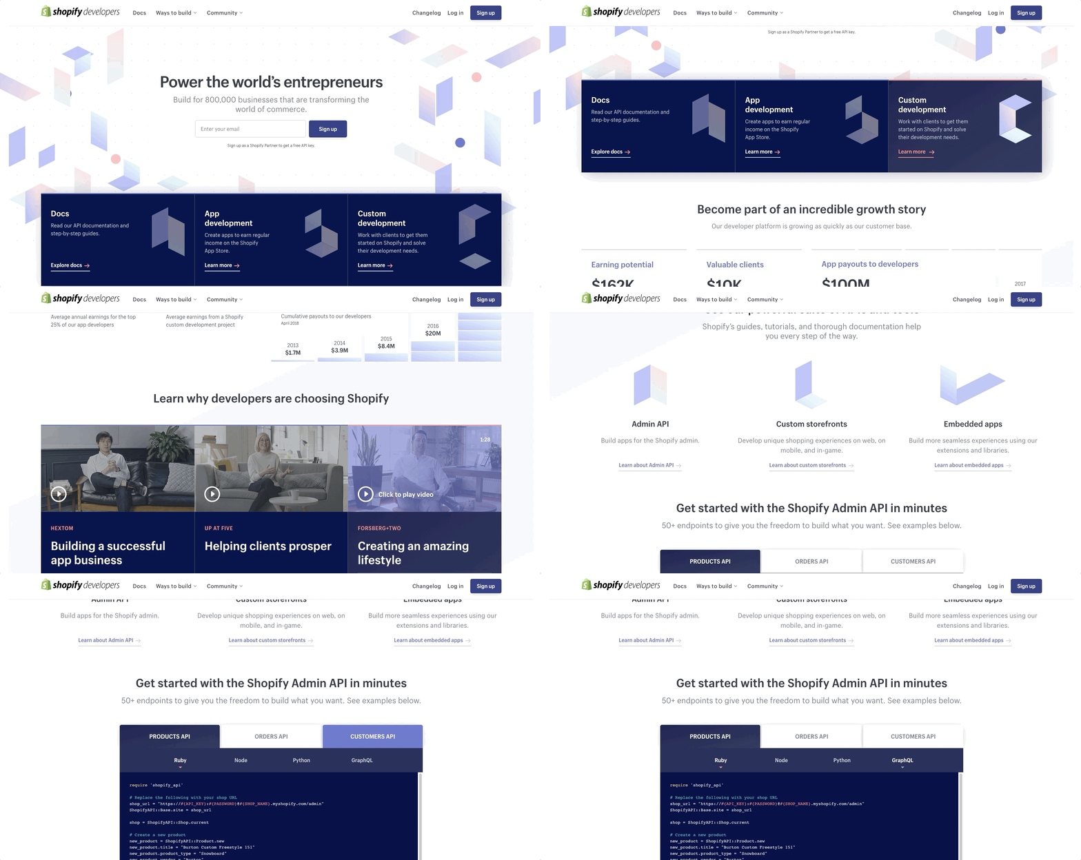
  • Small interactions can visually express that an element is interactive. E.g. the hover effect of buttons, icons, links, menu points or cards shows that they are clickable. Don’t forget that there is no hover effect on mobile devices: the interactive elements are tappable. Thus, you need to indicate tappavisually that they are tappable, e.g. place some icons (a play icon, an arrow, a chevron, a plus-minus, etc.) or use the link color.


Fine micro animations in several parts of the Shopify developers site. Not just the hover effects but the arrow icons also express that the given element is clickable.


  • Navigation: You can use animations to emphasize or hide certain parts in the navigation:
    • A dropdown menu which appears only when the user hovers over the parent menu point.
    • A sidebar navigation that can be opened when needed and closed when the user needs more space for the content and would like to focus on reading.
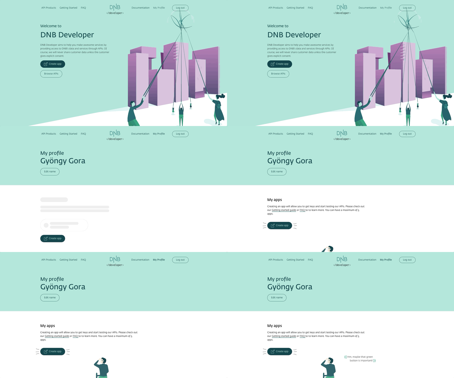
  • Think about default states and missing or loading content as well. While the site is loading, you can show the schematic shapes of the content which will appear later.


While the content is loading the schematic shapes of the content appear on DNB developer.


Loaders and progress indicators show users what is happening. E.g. get a spinner animation when you press the “load more” button on the API catalog listing page.
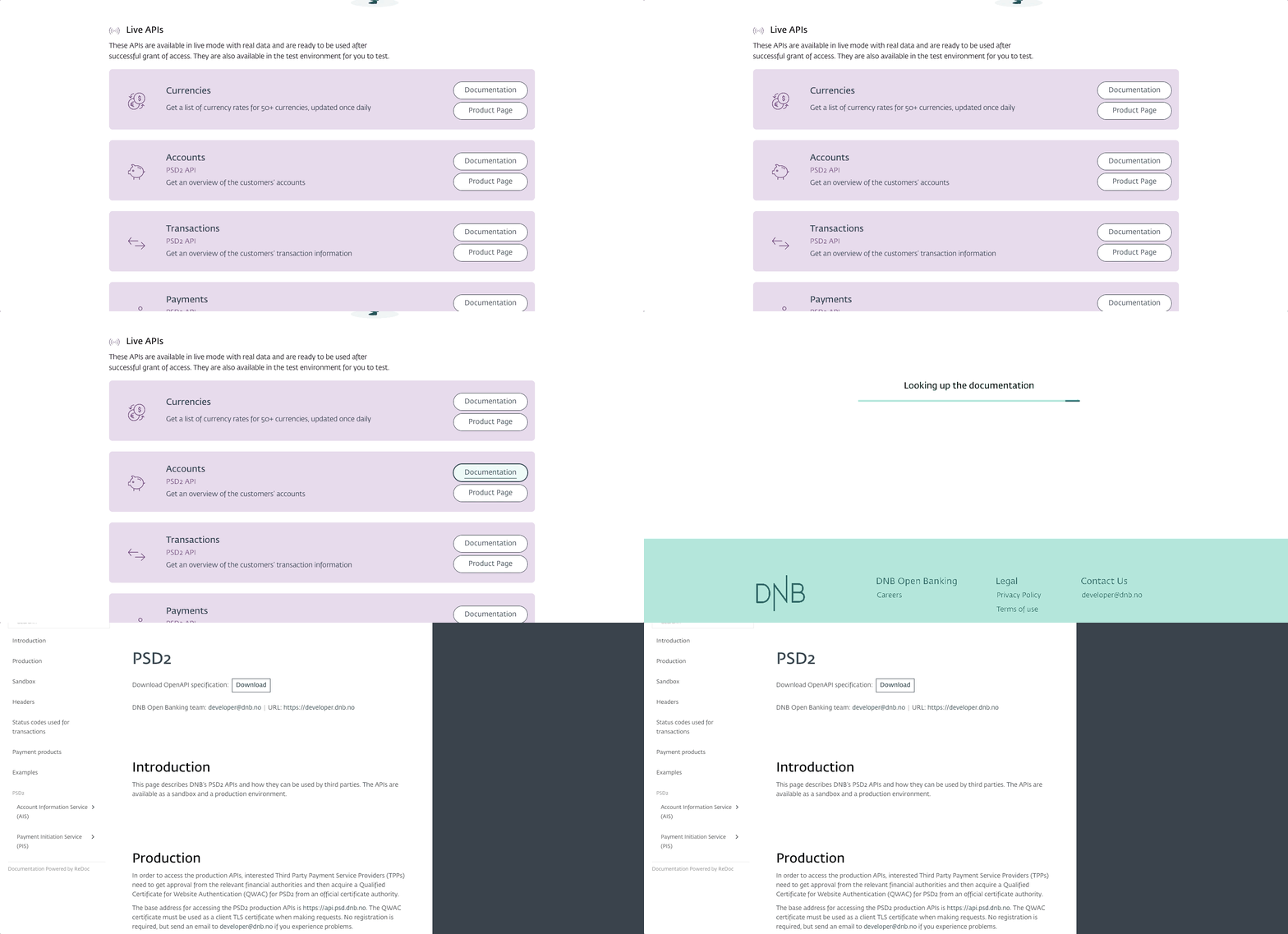


A loading animation appears on the DNB developer site when you click on an API card’s Documentation button.


  • A quick scrolling feature makes navigation easier.

With a “Back to top” button that scrolls fast to the top of the page, the user can reach the main menu or the breadcrumb instantly. They don’t have to scroll back to reach the header section. Inpage navigation can also have a quick scrolling effect. If the user clicks on an item in the inpage navigation the site quickly scrolls to the corresponding section of the site. We can find the two main use cases of this feature on documentation pages to scroll to a specific headline and on reference pages to scroll to different sections, like schemes, methods and models.
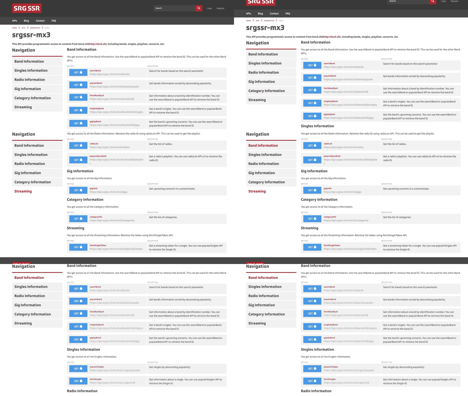
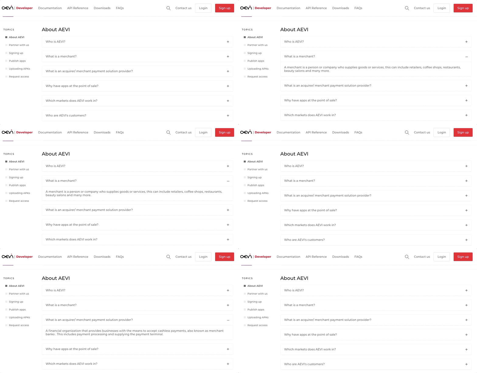


Inpage navigation with a quick scrolling effect to the different Method groups on the SRG SSR devportal.


  • Accordions are a great way to structure huge amounts of content: in closed state they make it easier for users to scan for specific information. After finding what they need, users can easily find the details while staying on the same page. FAQ sections often feature accordions. It can be useful on Reference pages too (e.g. to open and close the Method and Model sections) or in sidebar navigations to structure the menu hierarchy.


Accordions on Aevi developer.


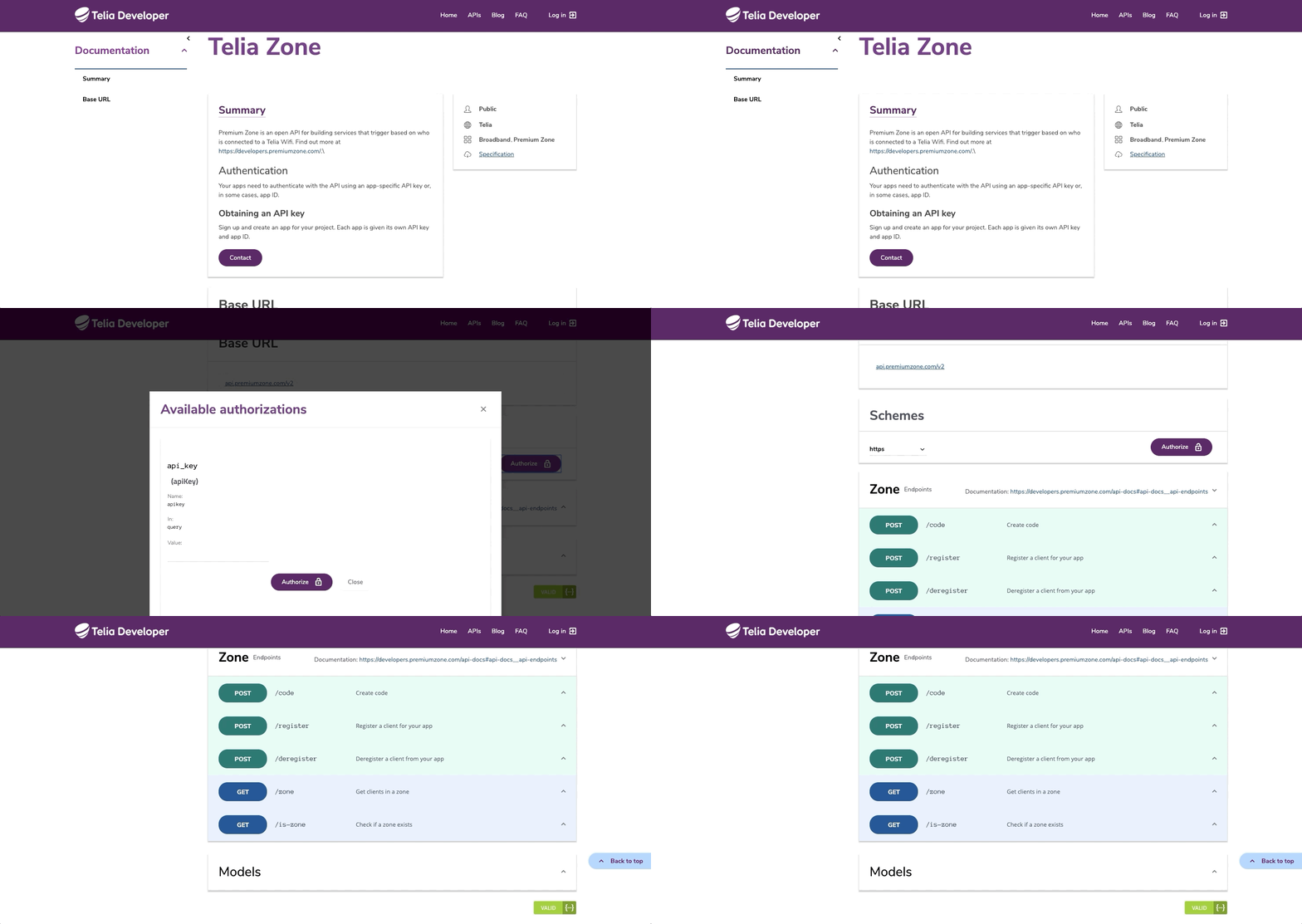
  • You can use popups to hide content at first sight and open it only when the user decides to see details. Popups are commonly used in the tryout or authorization sections of developer portals.


Openable-closable sidebar, popup (Authorize) and accordions give focus to or hide the desired page parts on Telia Developer.


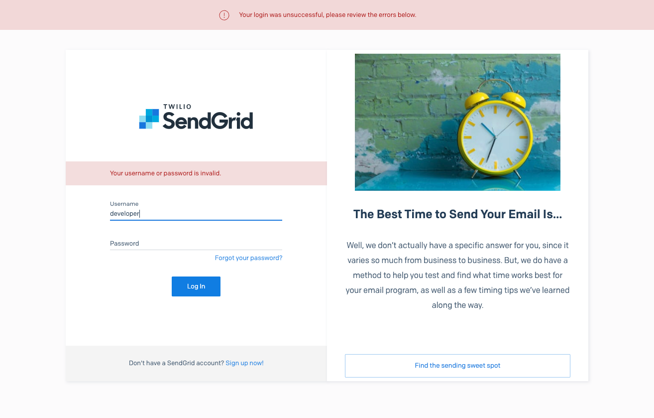
  • Micro-animations can make popup or toaster messages more prominent. Option: set the timing of such a message and make them disappear after a while without user interaction.


Sendgrid has prominent error messages.


  • Animated gifs (see examples in our previous posts!), step-by-step guidelines and animated flow charts can help the user understand a specific process.

Onboarding solutions

Always consider different kinds of audiences, serve all their needs and think about newcomers. Experienced or returning users might know what to do on your developer portal and where to find the information they need, but for people who land on your site for the first time not everything is clear.

Through onboarding sections, you can guide users towards specific goals. Make: these sections stand out: via stronger graphics, bolder colors, and proper placement.
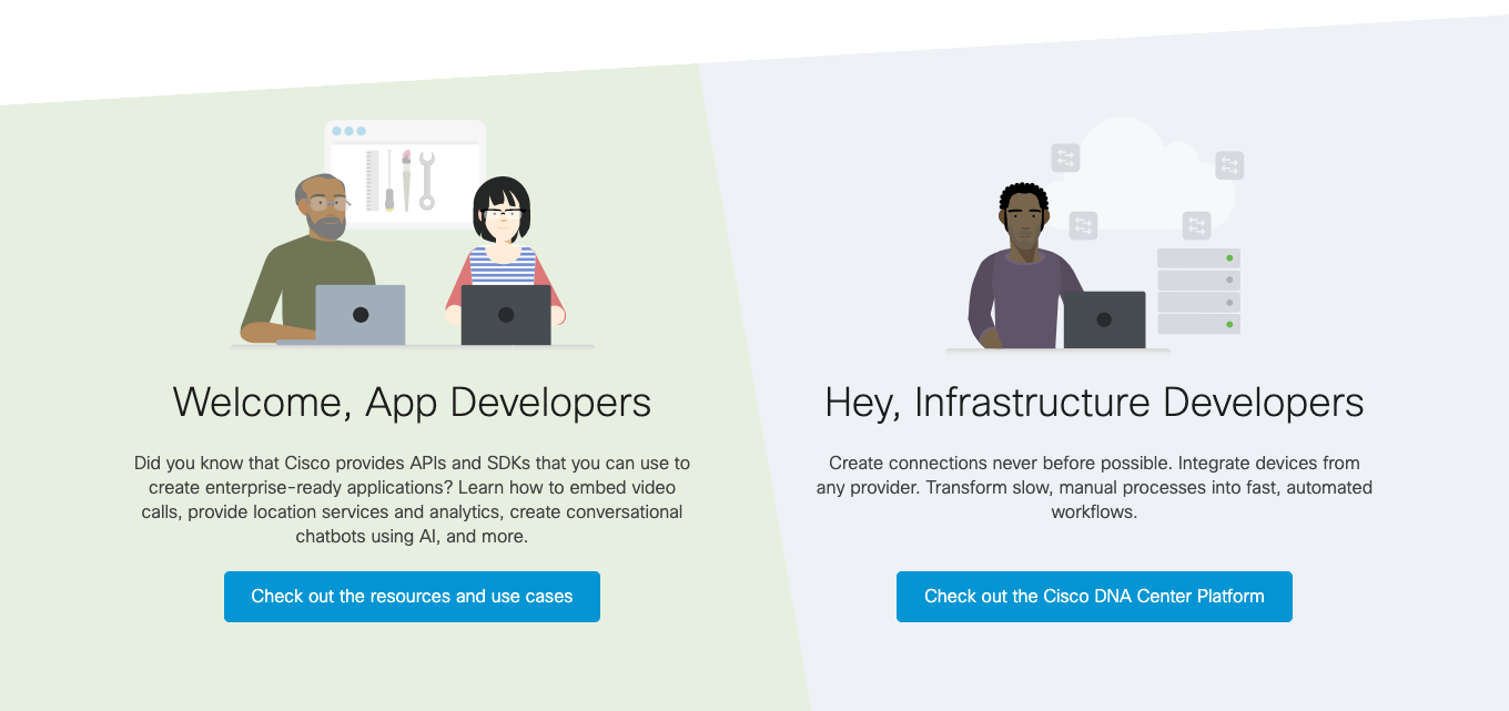
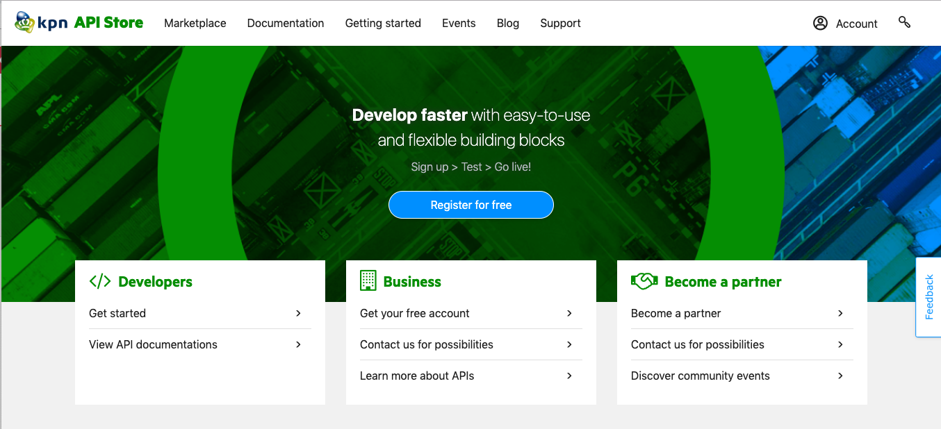


Cisco DEVNET has prominent error messages. This section addresses two different kinds of users.


Onboarding cards on the landing page of KPN API Store.


If applicable, use video tutorials or animated gifs to make the onboarding process smoother.

New users start their profile pages with blank sections and default states without a photo or apps. As a devportal provider, you can fill these —sometimes huge— empty areas with graphics or illustrations.
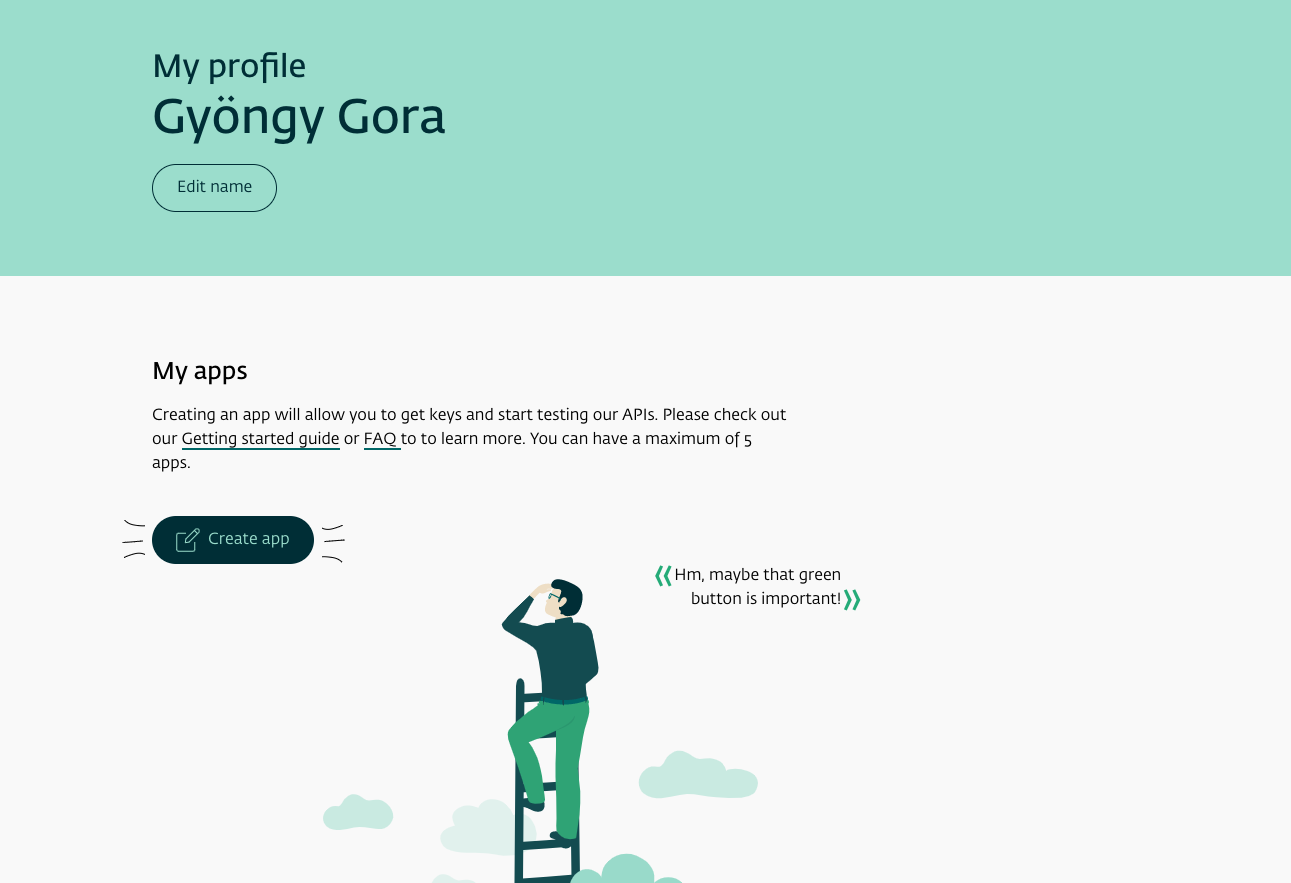
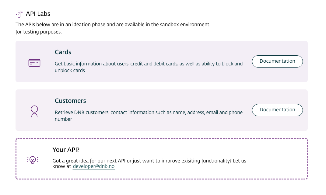


My profile page of the DNB developer site right after the first login.


A dashed border (different from the other cards) shows where you can leave a comment regarding APIs (DNB Developer).


404, and under maintenance pages are the best place for playful graphics. Be brave and don’t hesitate to use your imagination. A little joke always cheers up users in an annoying situation.
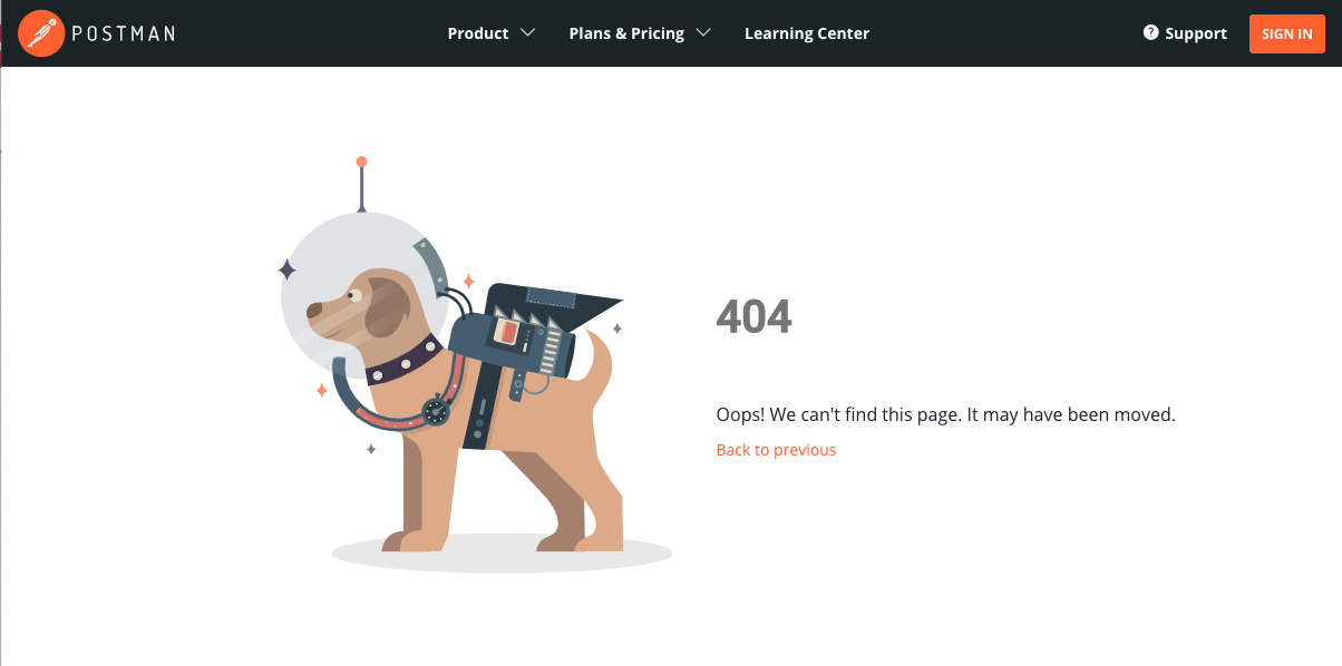


Postman's 404 page.


Sendgrid's 404 page.


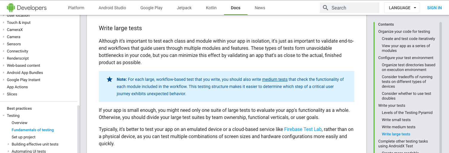
You can help users with highlighted tooltips and notes.

 
A highlighted note and a caution message with a matching utility background color and a meaningful icon on Android Developers.

Process visualization

Process visualization can help even the most experienced users to understand complex processes better. Unless you use some easily feasible solutions, such as styled tables, ordered and unordered lists, processes can be hard to visualize. Think about visuals to create:
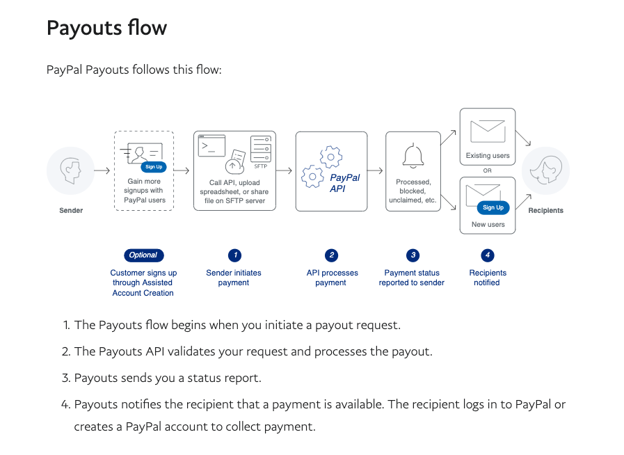
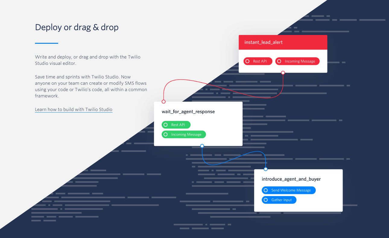
  • Flowcharts, mind maps, step-by-step illustrations,
  • Tutorials,
  • Explanatory illustrations.


A ‘step-by-step’ as a simple ordered list at the bottom and an explanatory flow chart on top (PayPal Developer).


An explanatory illustration on the Twilio site.


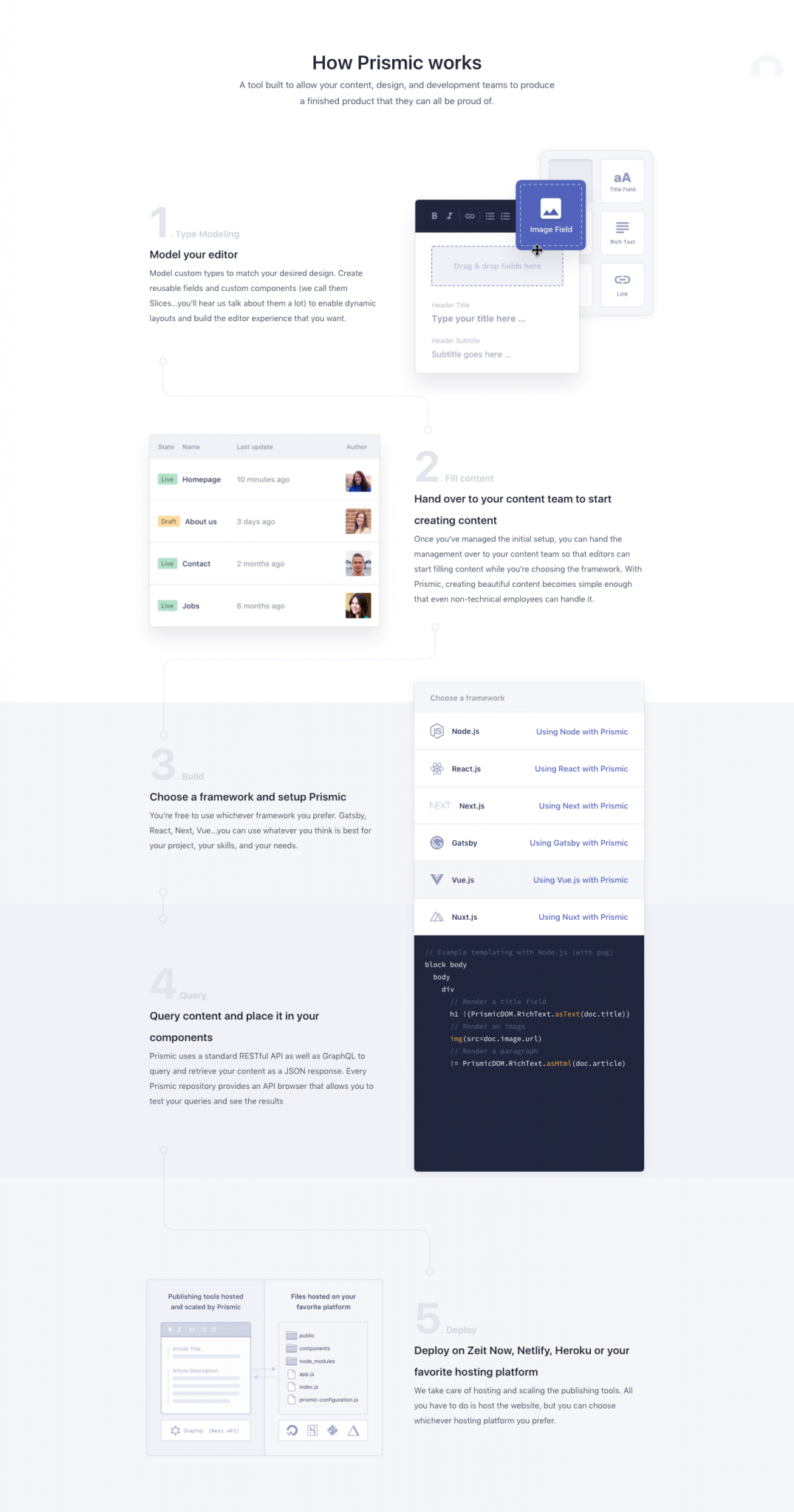
A detailed, illustrated step-by-step description on Prismic’s landing page.

Data visualization

Our brain can process huge amounts of data more easily if they are structured and illustrated. You can use tables, diagrams, charts, graphs or maps according to your taste. Their style can be adjusted to the brand colors which gives the site a consistent look.
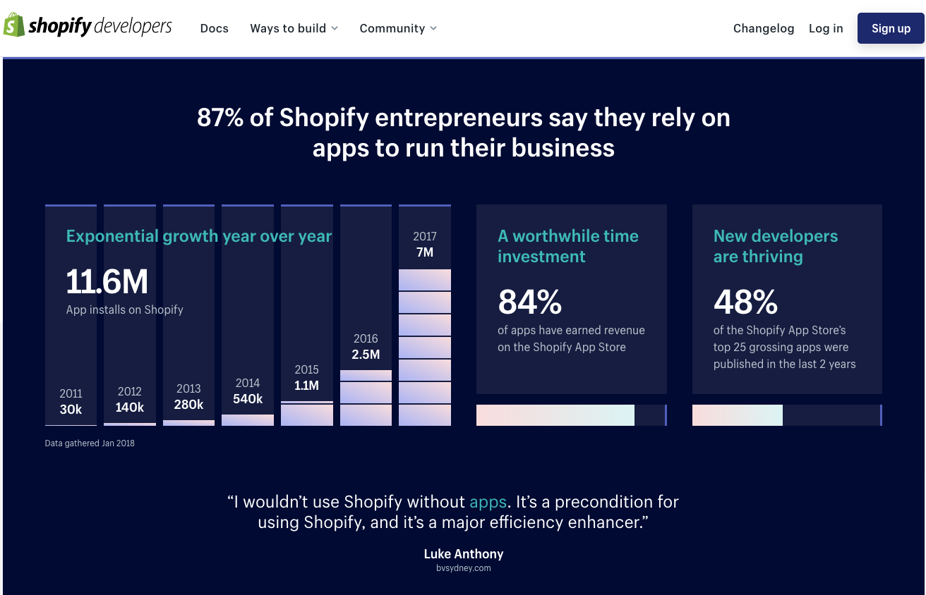
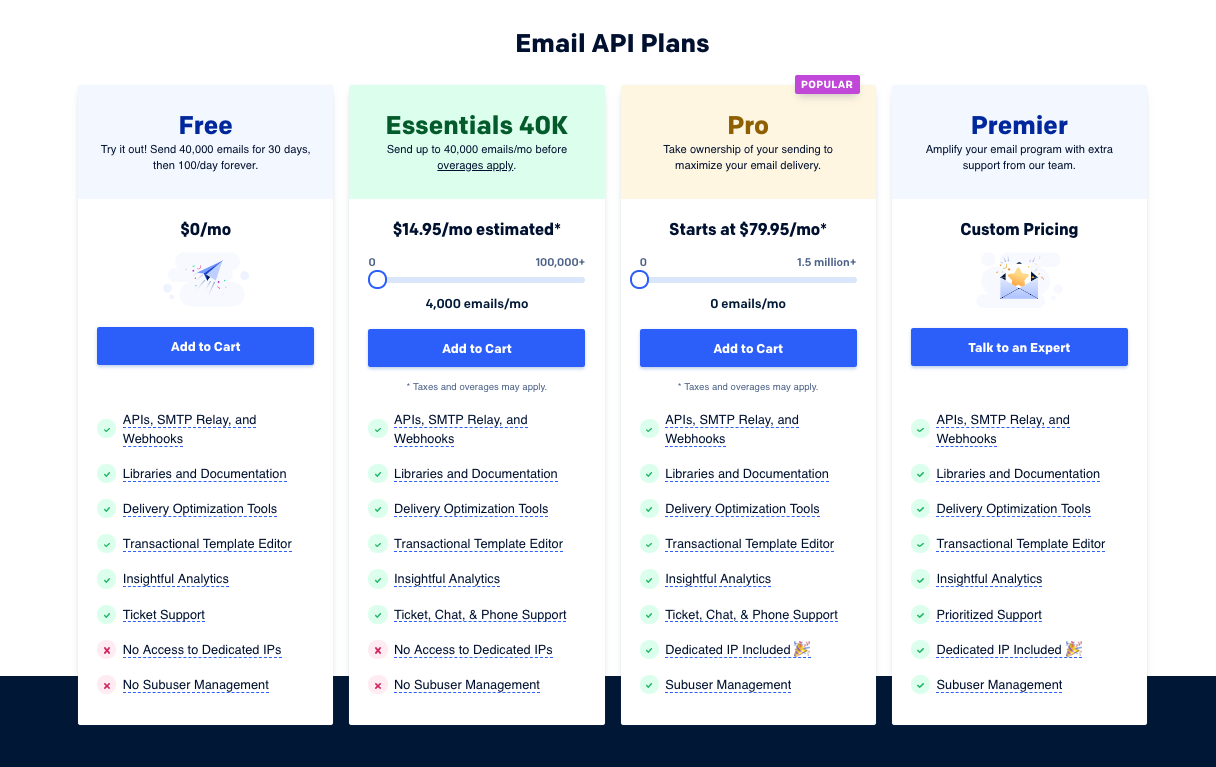


Data visualization about apps on Shopify developers’s landing page.


Styled table on Sendgrid’s landing page.


Maps show Orange developer's product availability.

Improve API cards

We’ve already showed some examples in the previous articles, but there are several visual solutions to make API cards more transparent and colorful. Use:

  • Icons,
  • Status indicators,
  • Version numbers,
  • Tags,
  • Local availability,
  • Division,
  • Featured signs,
  • Links and buttons.

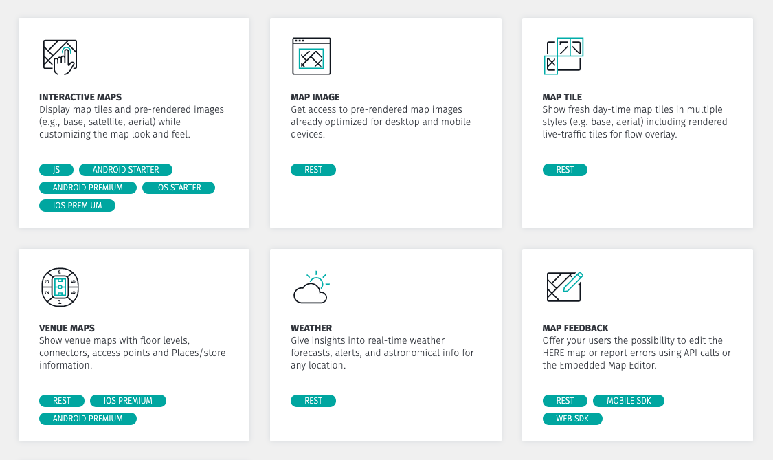
Have categories with different visual elements, such as icons, colors, tags, card backgrounds or colorful card borders.
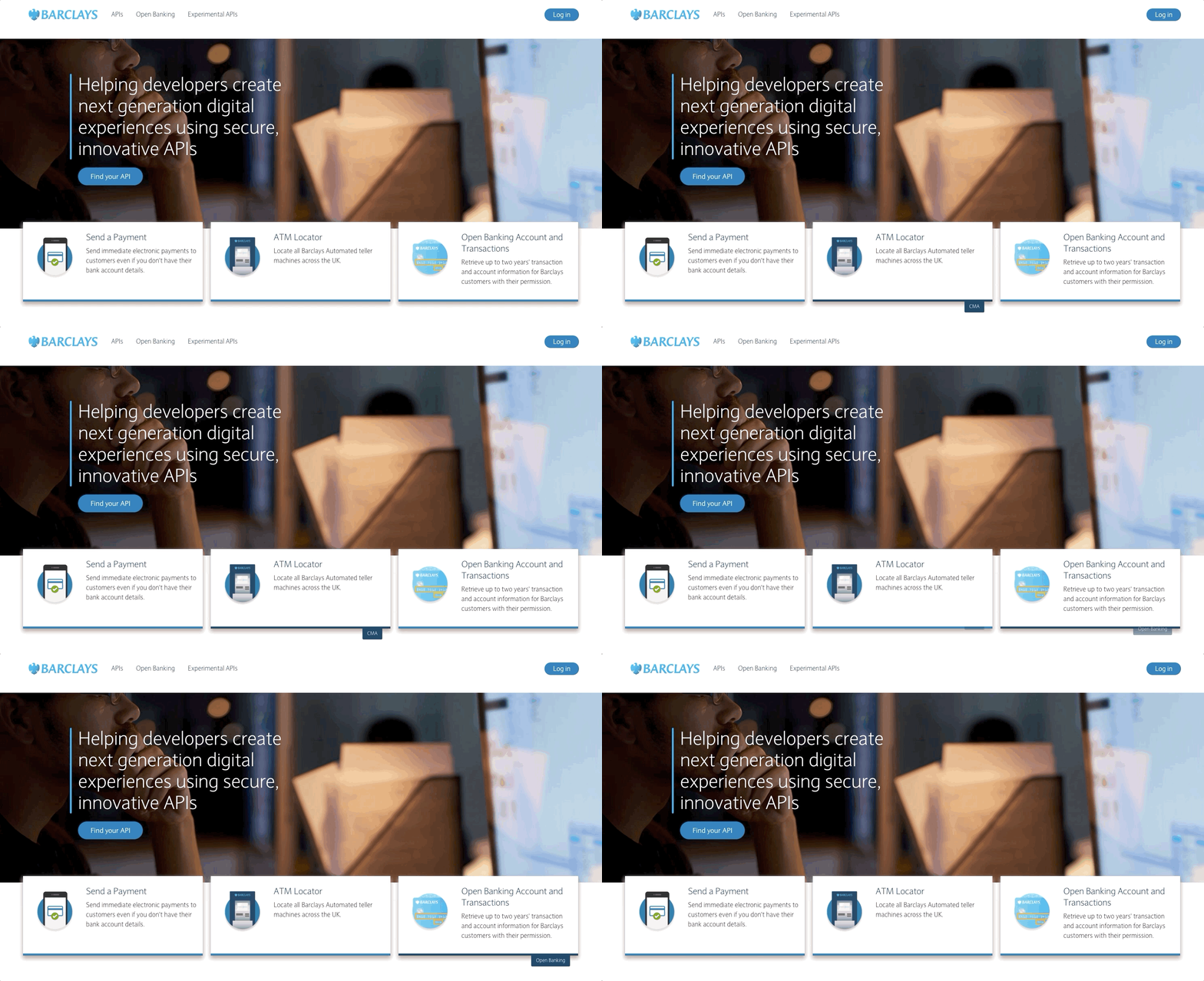


The API cards have a border color (note: this can be a different color per category) and the category name appears if we hover over the cards on the Barclays devportal.
Icons and tags on the API cards of the Here developer portal.
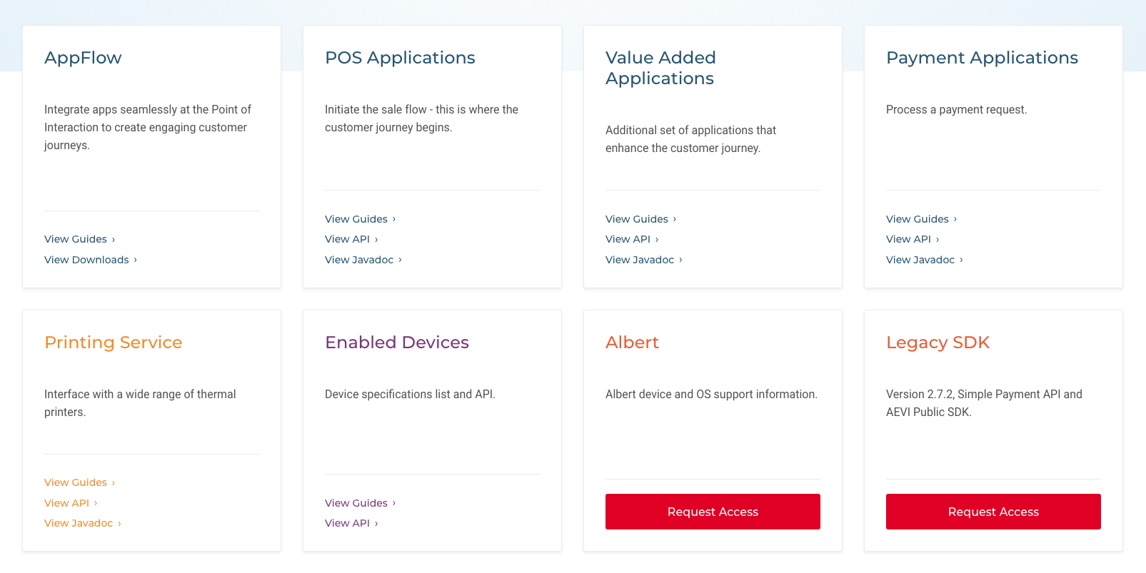
Clean, pure text API cards on Aevi Developer. Although there aren’t any graphical elements on the cards, the colors that were used for the typography, the divider line, and the links make the cards aesthetic and easy to scan.
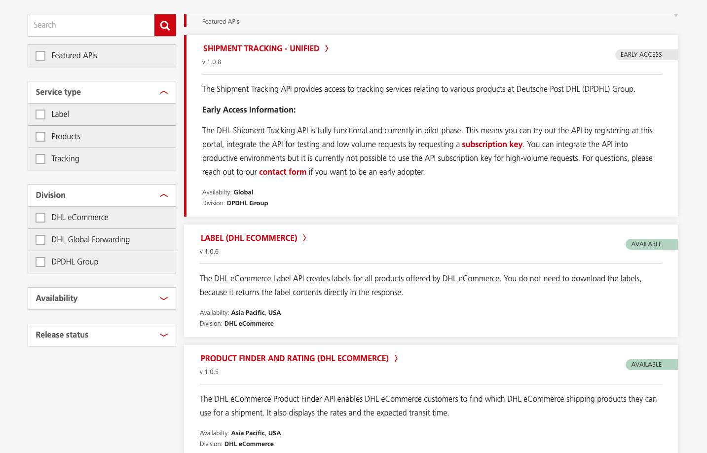
API cards on the DHL API Developer Portal with version numbers, status indicators, availability and division. Features APIs are highlighted with a prominent vertical red line.

Social media UI elements & developer engagement

Developers might like to contribute to their community in some way, so let them share solutions, search for help and state their opinion, e.g. provide them with the possibility to:

  • Rate tutorials, how tos or documentation.
  • Submit a comment and discuss comments.

As they like quick and efficient solutions, we suggest to use common design patterns, simple well-known icons for these features, like:

  • Sharing icons (for docs, code, tutorials etc),
  • Like or dislike icons,
  • Stars or heart icons for ratings,
  • Bookmark icons for saving,
  • Comment icons.


A simple and efficient solution that gives users the possibility to express an overall opinion on platformOS.


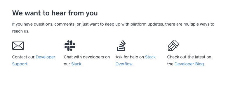
Social section on Square Developer.


Rating solution on Android Developers.

We hope you enjoyed our DevPortal Design Guide series! Have you already checked the previous articles?
  1. Developer portals on different devices; responsiveness.
  2. Common devportal layouts: advantages, disadvantages. Navigation solutions and suggestions regarding layout.
  3. Actual devportal design trends; brand consistency. The balance between aesthetics, content, and functionality.
  4. Basic graphical elements that support functionality, like icons, colors, imagery, and typography.


Pronovix Logo

Are you building a developer portal? Interested in a shortcut? As a devportal specialist, Pronovix has developed 30+ page templates specifically designed for devportals. Talk with us to learn how our MVP package can accelerate and simplify your devportal launch.
Contact us »


Developer Portal: Design Guide Series In this series you will learn about common design patterns, get an insight into Pronovix' project work related experience, and learn how we tackle the design of a developer portal user interface.

Read more »        Contact us »


Gyöngy is a Senior Designer. She enjoys working with UX researchers, developers and content writers to find the best visual interpretation of an idea. Although she is passionate about design, she likes to maintain balance between design, functionality and content.

She graduated as a computer program designer and specialized in image processing. This IT background helps her establish an efficient workflow between the design and development phases of projects.

Before entering the company she has worked as a webdesigner and mobile application designer, so she has been working as a designer altogether for 10 years now.

Newsletter

Articles on devportals, DX and API docs, event recaps, webinars, and more. Sign up to be up to date with the latest trends and best practices.


Subscribe